Currently there are more than 6 million advertisers on Facebook. That is more than any other social media platform.
Why? Because Facebook ads offer massive ROI by allowing you to target your audience by location, demographics, age, gender, interests, behavior, and connections.
But to make this work you have to create highly effective Facebook ads. You have to optimize your content, graphics, CTA, landing pages, and your targeting methods.
However, in this post, I’ll only talk about the first 3 ingredients. I’ll show you some successful Facebook ad examples of multiple brands.
These ads will not only give you an idea about what everyone else is doing but they will also evoke your creativity.
All these Facebook ad examples are broadly categorized into 7 industries. You can refer to the ones your business fits in.
241+ Facebook Ad Examples
You’ll find a combination of photo ads, carousel ads, and video ads on this list. These screenshots are either taken from my own Facebook account or from the Facebook Ads Library.
But before starting, there’s one thing I wanted to talk about – Facebook Ads 20% Text Rule
If you have created ads in Ads Manager, you’ll know about this rule. It states that advertisers can cover their ads’ images with not more than 20% text.
There was a time when this rule was mandatory but now you can easily get past this. You can use more than 20% text in your ad creatives but Facebook does warn you that it might limit your ad reach. In simple terms, the more text in your image, the more will it cost with less distribution.
In this post, you see how advertisers are experimenting with their ad variants to get maximum ROI.
Now let’s just jump right into it…
eCommerce Facebook Ad Examples
eCommerce is one of the most competitive industries today.
And considering the current pandemic (The COVID-19), it is only going to grow. Almost every business is going to be online within the upcoming years.
To cut through this noise, you need to find creative ways to reach your audience. Keep an eye out for recent trends, test multiple variants of your ads, and take inspiration from the following Facebook ad examples.
1. SHEIN
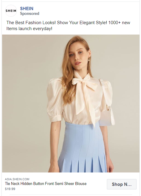
SHEIN, an international B2C fast fashion brand displays a single product in its ad. Their ad copy drives our curiosity by adding a number ‘1000+ new items’.
2. Poo~Pourri
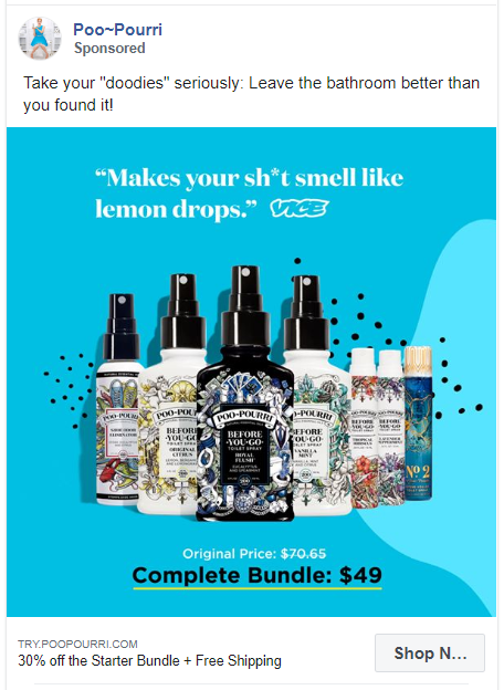
You can easily intrigue your audience with a cheesy one-liner. This ad shows what the product does, how it looks like, and how much it will cost you. It is a complete package.
3. Pura Vida Bracelets
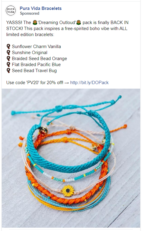
Pura Vida Bracelets not only shows all their products in the picture but mentions their name in the ad copy. They have also mentioned the coupon code in the caption to increase clicks.
4. MeUndies
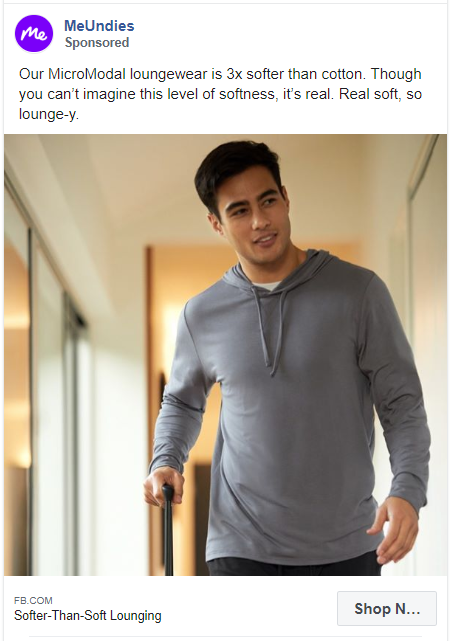
What is so unique about your product? MeUndies does a great job of highlighting their USP that their loungewear is 3x softer than cotton.
5. Etsy
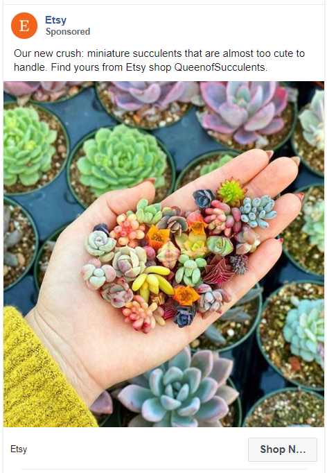
For someone who loves miniature succulents, this ad has everything. A picture that is too cute to handle and the name of the store who sells these.
6. True&Co
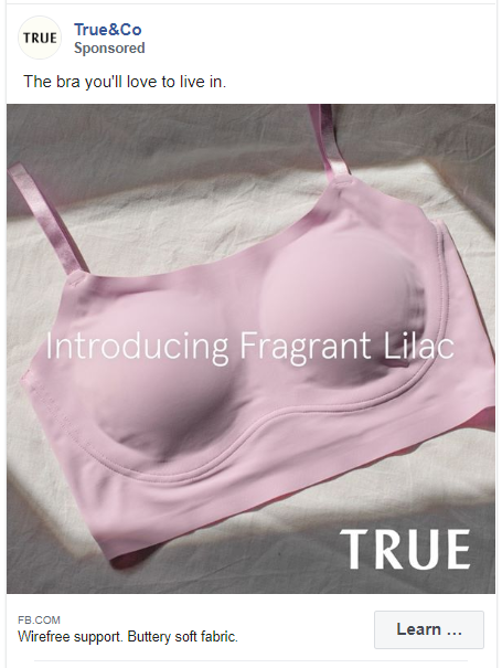
What most people hate about bras? They aren’t comfortable! This ad by True&Co addresses and solves this problem in just 7 words. They sell bras that you’ll love to live in.
7. Lume Deodorant
Video ads are the hottest trend right now. Add your client’s testimonial to that and you have a winning Facebook ad.
Also, notice that this ad has 2 links – in the ad copy and below the video.
8. IKEA
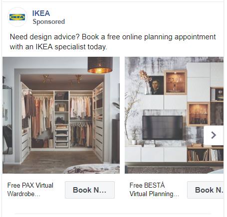
Plan out what you want to give in your Facebook ad. Even if you are an e-commerce brand, your ads don’t have to be about your products.
IKEA is giving free design consulting with their ads. They have added carousel images of different rooms designed with their furniture.
9. Happy Socks
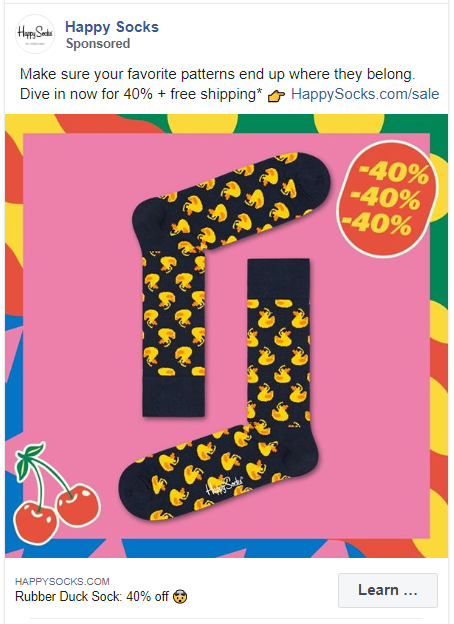
Fun vibrant colors in the graphics are sure to make any user stop scrolling. Happy Socks does a great job at announcing their 40% sale with a simple one liner copy and a picture of their product.
10. Chanel
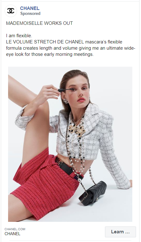
Chanel is promoting their mascara for its flexible formula that gives length and volume. Plus, the ad copy uses French words to show off the brand’s French heritage.
11. Dell
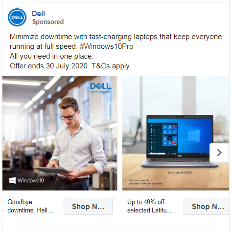
Dell’s carousel ad doesn’t just tell what their product does but also tells how this feature will benefit you. They have fast charging laptops that will minimize your downtime.
12. Gillette
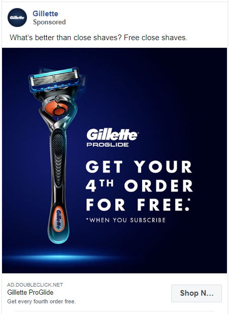
Everyone loves free stuff! Don’t ever shy away from using this word. This Facebook ad example of Gillette features their product next to an enticing offer.
13. Winc
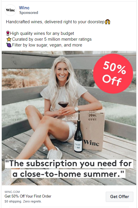
This ad by Winc plays to all kinds of wine drinkers. No matter what’s your budget or your taste, you’ll find something on their website. It also gets brownie points for using emojis effectively.
14. Marvel
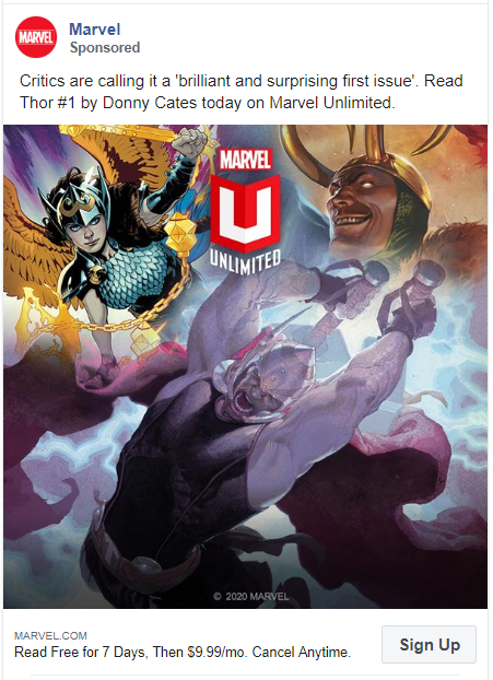
Marvel’s Facebook ad example shows another unique way to add testimonials. Also, no Marvel fan would be able to resist this ad with those exceptional graphics of Thor.
15. TAG Heuer
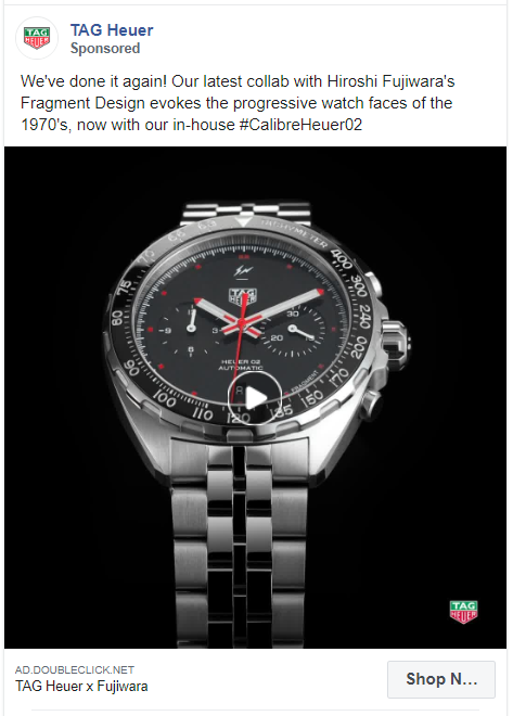
With this simple yet capturing ad, TAG Heuer has really done it again. They have unveiled their new collaboration with Hiroshi Fujiwara in this ad with just a picture of the watch and a hashtag.
16. Dollar Shave Club
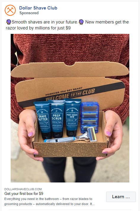
A real image of the product in the hands of a user works much better than an edited image. Dollar Shave Club incorporated a real image of their box and added the price in the caption of this Facebook ad.
17. Tiffany & Co.
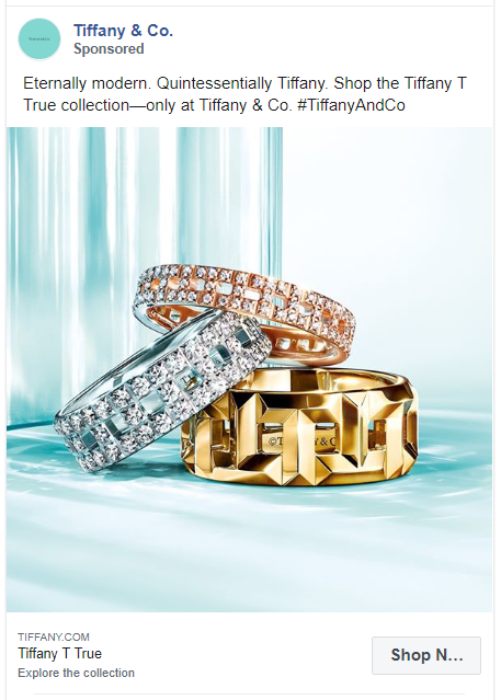
Most successful ads use simple words but we have to make an exception for a brand like Tiffany & Co. Everything about this ad from the caption to the image screams the luxury offered by this jewelry brand.
18. TOMS
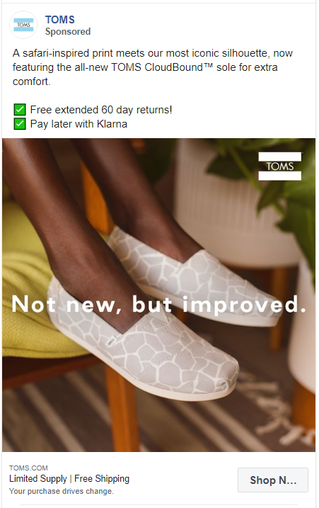
This ad has everything you need to know before buying. What is unique about the product? TOMS CloudBound Extra comfort sole. How to pay? With Klarna. Any guarantee? 60 days returns.
You won’t even have to think twice before buying.
19. Philips
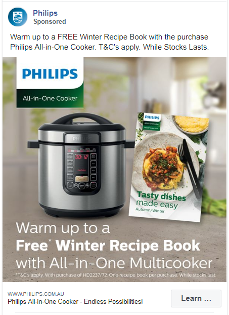
Philips uses a popular selling tactic in this ad. Instead of focusing on the actual product, the multicooker, they’re focusing on the free gift you’ll get with this purchase. Why does this work? Everyone sells multicooker but nobody gives you a free recipe book.
20. M.M.LaFleur
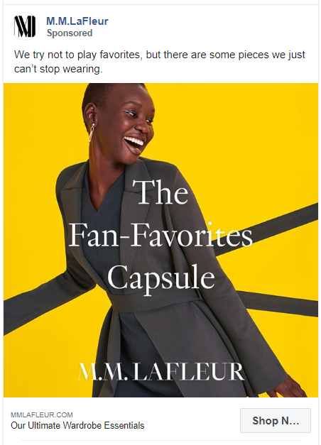
You don’t always have to mention the features of your product. A fun quirky caption works really well in Facebook ads.
21. Forgotten Tribes
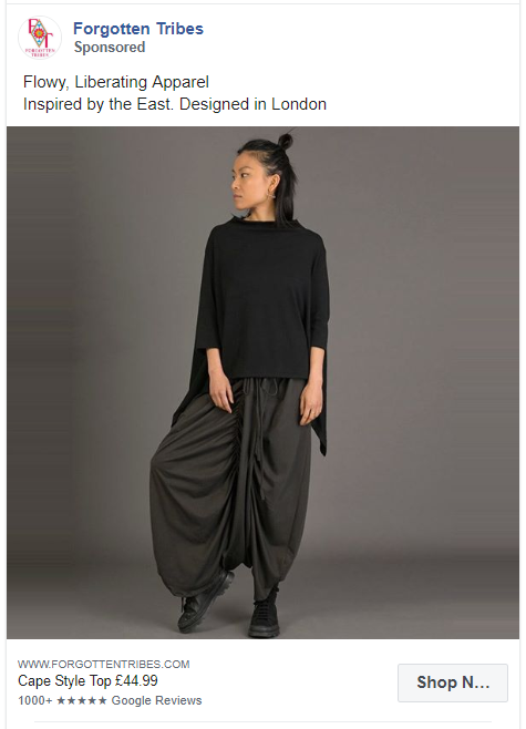
Comfort = Style for Forgotten Tribes. They have their unofficial tag lines in the caption with the picture of their product and a shop now button.
22. Moon Magic
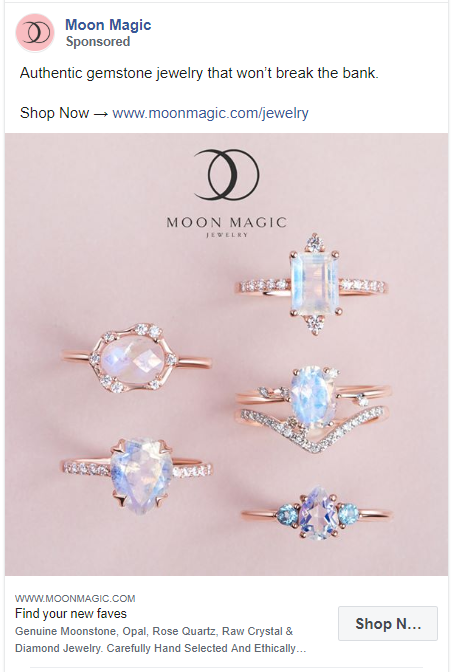
One-line caption, two links – caption and a button, and a picture featuring 5 beautiful rings. That’s how Moon Magic creates a successful Facebook ad.
23. Brooklinen
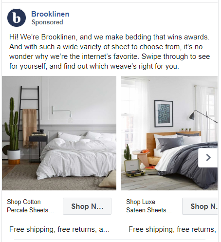
It’s okay to brag but only if you do it like Brooklinen. They make bedding that wins awards and they are the internet’s favourite. This strong statement with a carousel ad of all their products is hard to ignore.
24. Trojan
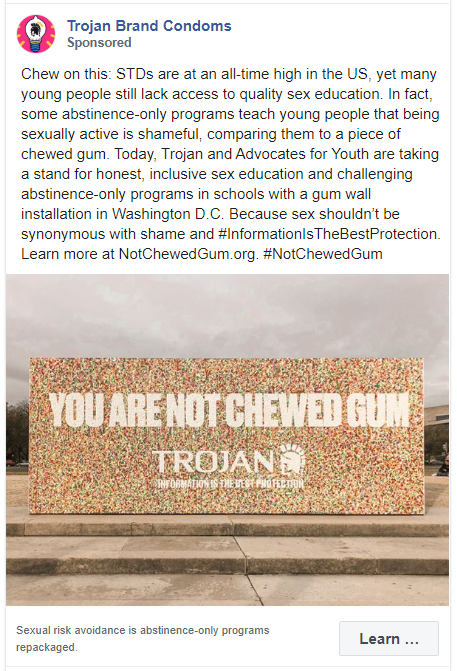
If you can start a trend with your ad, you’ll win the internet. Trojan started a hashtag ‘NotChewedGum’ highlighting the importance of sex education and prevention against STDs. They did all this by promoting the use of their product.
25. Tissot
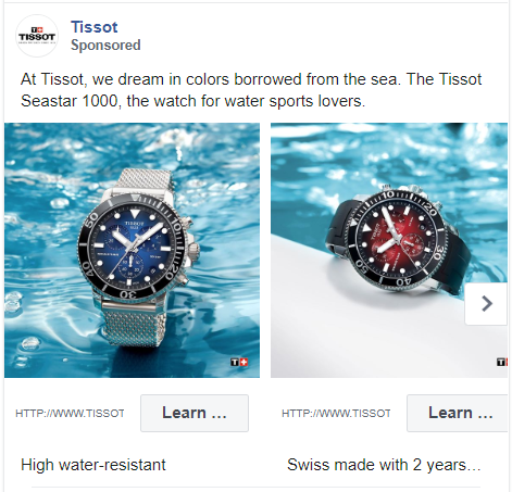
Tissot’s carousel ad works because of its simplicity. High water resistant watches displayed with the background of water wins at every level.
26. Blue Nile
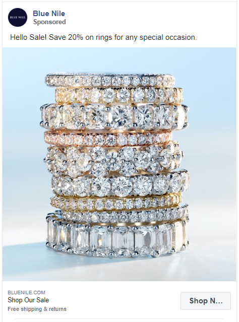
An ad campaign created around your latest sale will guarantee an increase in your ROI. The Blue Nile’s Facebook ad teaches how to do this is the most minimalistic way ever.
27. Nixit
You can never go wrong with a video testimonial. If you cannot get hold of the actual person just quote their awesome testimonial with your product. It works!
28. Amazon Kindle
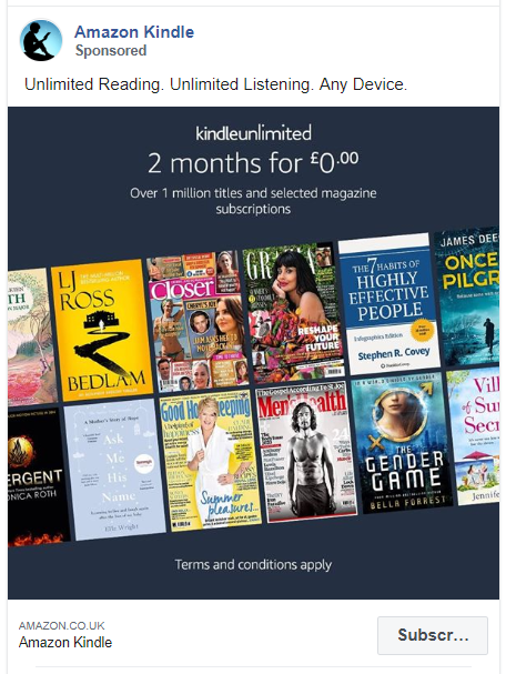
Sentences can be overrated. Use minimal words to explain your product to your potential customers.
29. Best Self Co
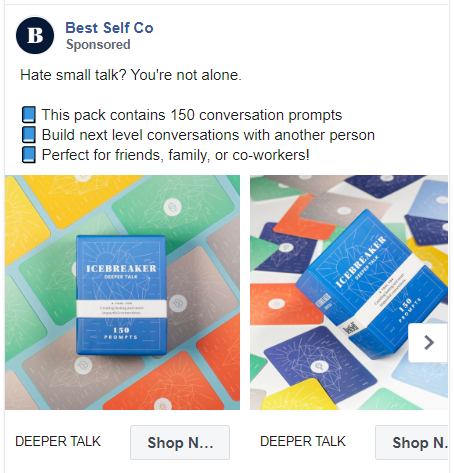
Within the first 3 words, this carousel ad will relate to most people. The ad copy tells you what the product is, what it does, and who can use it.
30. Simba
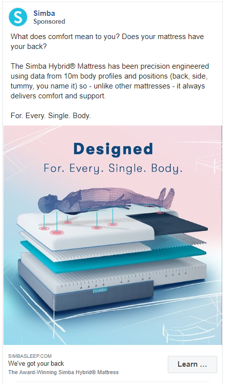
Instead of showing the actual product, use a graphic representation of what your product is made of.
The image of this Facebook ad breaks down the Simba mattress into layers. Their caption tells the audience how uniquely they created this product.
31. Darn Tough Vermont Socks
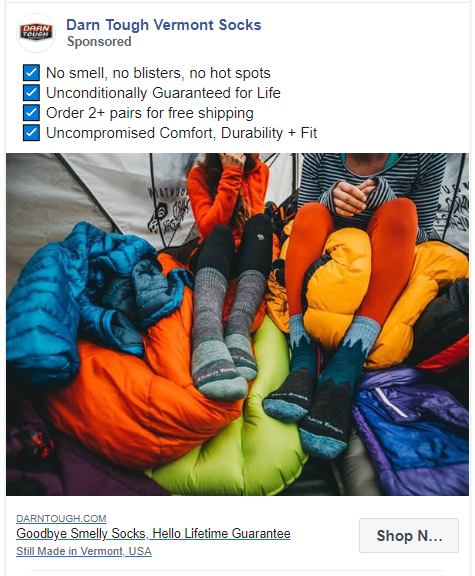
Another Facebook ad example with the image of the product accompanied by 4 unique features. Free shipping, unconditional guarantee, and ultimate comfort, this ad promises everything.
32. Dermadry
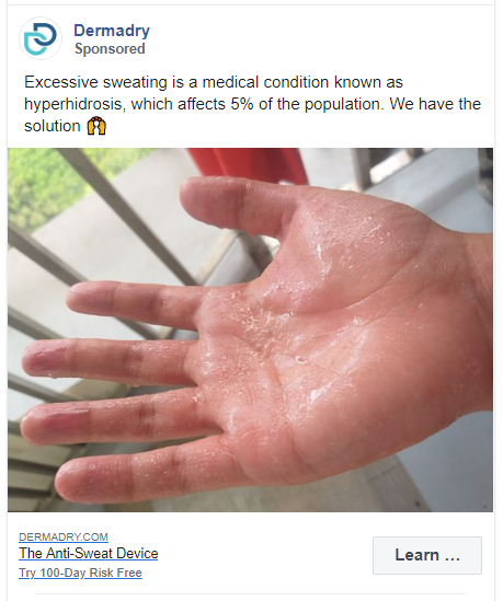
Get creative with what you want to show in your Facebook ad. It doesn’t have to be the product but it could be the mess your product solves.
Like in this one, Dermadry is selling its anti-sweat device with a picture of a sweaty hand.
33. Spinn Coffee
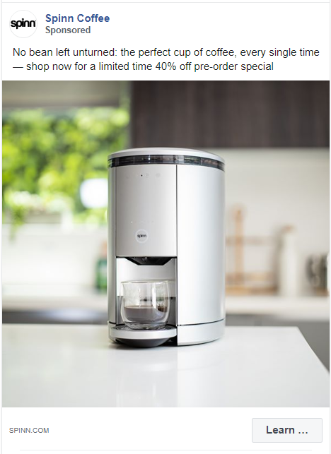
The most no-nonsense ad ever. Spinn Coffee has displayed a picture of their coffee maker with a limited time discount offer.
34. Inkbox Tattoo
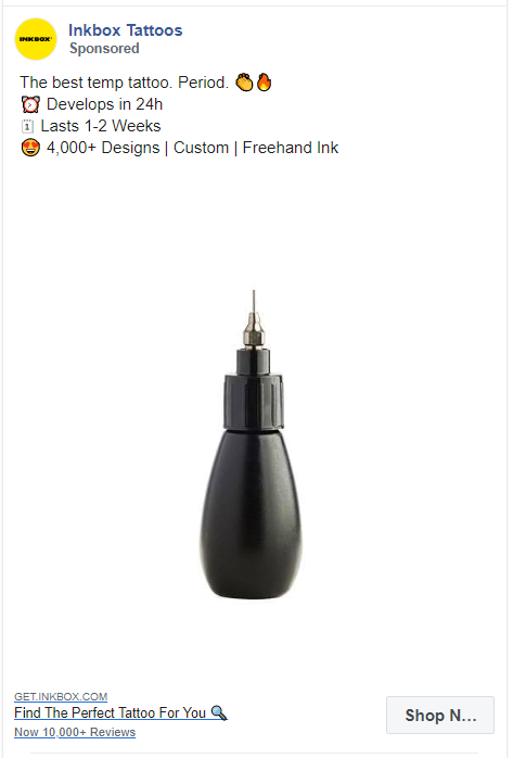
This is another ad with just a picture of the product and loads of white space. Inkbox Tattoo have shown a picture of their Freehand Ink. In the caption, they have mentioned all the unique features of their product.
35. Dyper
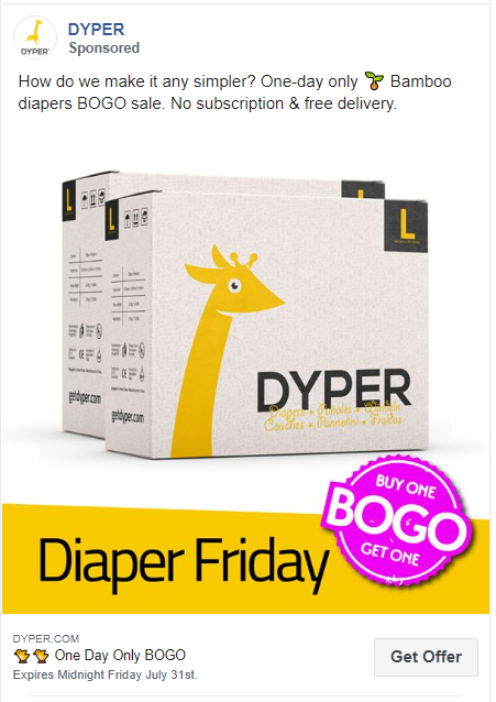
Dyper showcases its eco-friendly bamboo diaper subscription boxes with a special deal. This perfect ad copy targeted to moms who support environmental causes is enough to rope in hundreds of customers.
36. Ritual
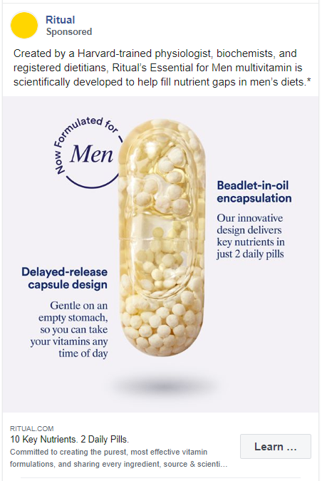
People always think twice before buying any new medicine online. Ritual realizes this problem and offers a reliable Facebook ad.
Their image shows exactly what is inside the pills and the caption mentions how these were created by some of the most trustworthy people.
37. Finnish Design Shop
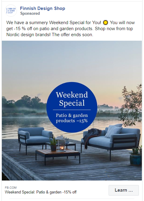
Who doesn’t love a summery weekend? Finnish Design Shop is offering a special discount in their ad to make this even more inviting.
38. Invisalign
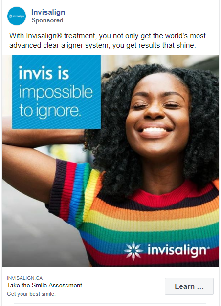
This is another great Facebook ad example, that isn’t directly selling to their audience. Invisalign® is asking their audience to take a smile assessment to see if this treatment is right for them.
39. JBL
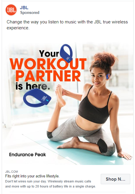
This JBL ad targets people who work out. They have cleverly named it your workout partner.
Both the image and the caption of the ad tells what the product is without disclosing too many features. It is simple, precise, and very focused.
40. Sonos
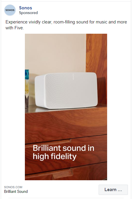
Sonos ran this variant of ad with an image of the product with a simple brand message. The caption is also a one-liner mentioning the features of the product.
41. Lenskart
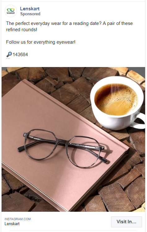
What do I love about this ad? Lenskart has added the unique code of the eyeglasses featured in the ad. So if someone loves the frame, they can easily find them on their website.
42. LINJER
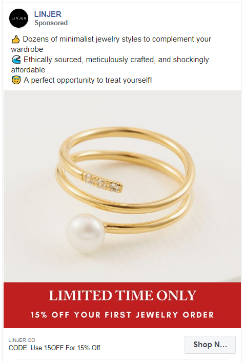
Another Facebook ad example with effectively used emojis as bullet points. LINJER made sure that every word in their caption holds a meaning.
43. Nykaa
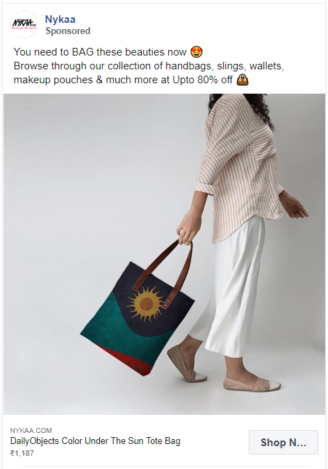
Everyone loves a good wordplay like the one in this ad copy. Also, Nykaa mentions everything you can shop for on their website with an amazing deal.
44. BarkBox
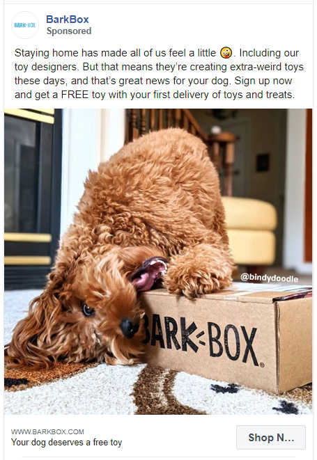
I don’t know about you but I always stop scrolling for a dog picture.
BarkBox has successfully added the image of its product with its end-user. And the caption is just brilliant.
45. Nuud Care
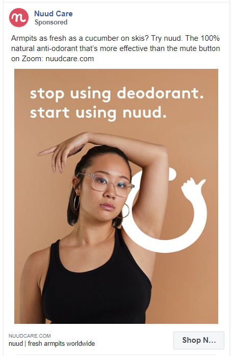
Humor works great in advertising. It grabs attention, sends out a positive brand image, and leaves a lasting impression.
Nuud Care is selling 100% natural anti odorant in this ad. I am definitely intrigued to try out something that’s more effective than the mute button on Zoom.
46. DripDrop
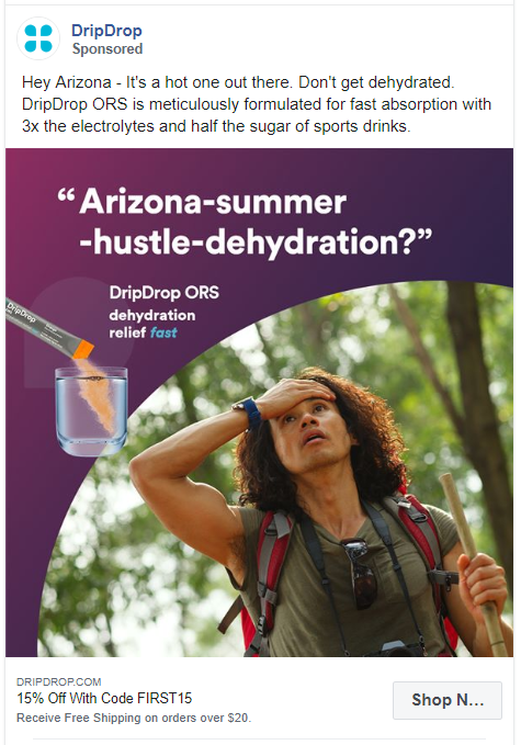
DripDrop ran multiple variants of this ad for every state in the USA. The only thing they changed was the name of the state in the ad copy.
People living in the state who see the ad directly addressed to them, will be more willing to try their product.
47. The Sill
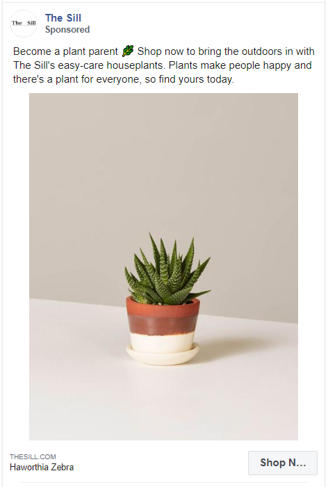
We love good, clean pictures and that’s what The Sill has used in this ad. An image of a small plant with a convincing caption is spot on!
48. Peugeot Malaysia

Always craft your ads considering who is your potential buyer and what they are looking for.
Peugeot Malaysia designs SUVs for business drivers. They have crafted a simple classy caption encouraging great saving options.
49. Quay Australia
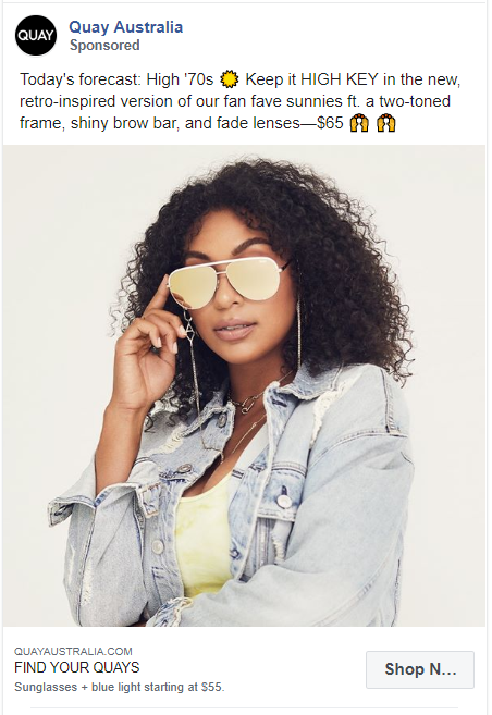
Quay Australia’s Facebook ad is both creative and visually appealing with transparent pricing. The audience knows what to expect in these sunglasses just by reading the copy.
50. Livia
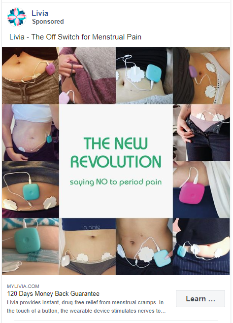
One of my favorite Facebook ad examples on this list.
Livia has created a collage of their product used by real people. This effort will serve 2 purposes – it increases your credibility and shows the audience how to use your product.
51. Rothy’s
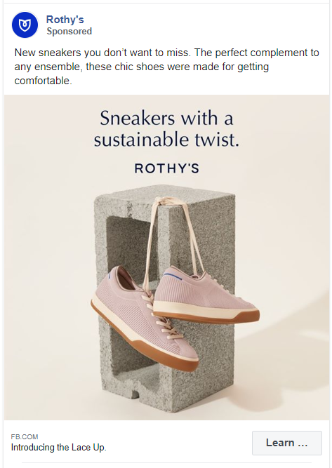
Rothy’s sneaker ad shows their product with their brand message. It lets the audience know what’s so special about these without leaving it to the imagination.
52. Shoppers Stop
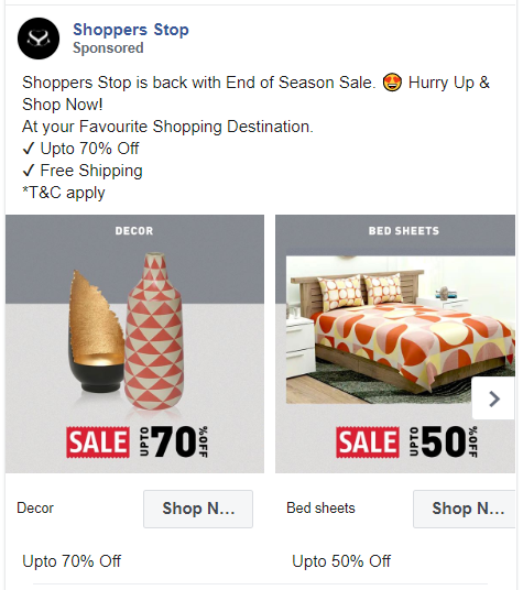
Shoppers Stop made a carousel ad showcasing multiple categories of their products with their special sale offer. They have featured a massive selection that consumers can choose from.
53. Buffy
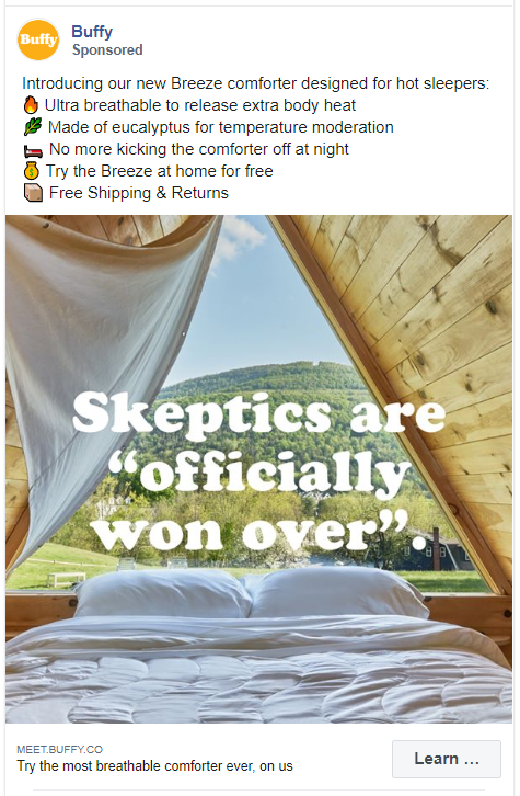
Looks like using emojis as bullet points is a new trend. It does make the caption interesting. Plus you can cover many features of your products without confusing the reader.
54. Snag Tights
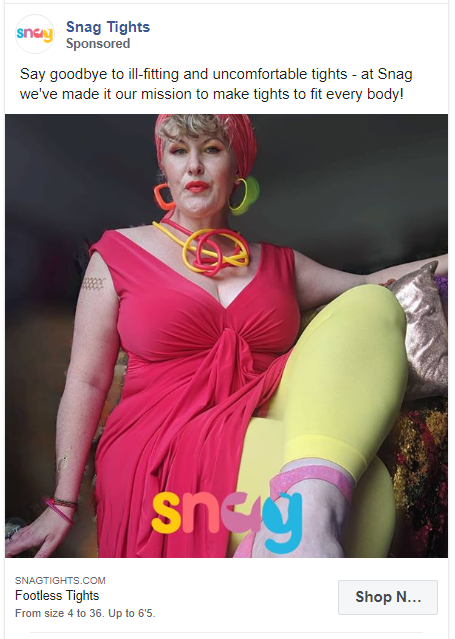
This simple and colorful product ad by Snag Tights instantly catches attention. It addresses the problem with other brand’s and allows this product to stand out.
55. Fabletics
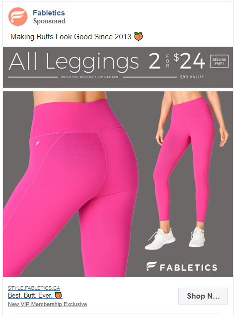
This is how you sell your product with a quirky one-liner. Fabletics do not hesitate in pointing out the best feature of their product. They have accompanied this with a simple picture of their product and transparent pricing.
56. Sperry
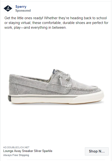
The image in this Facebook ad example perfectly uses the white space. It is just the picture of their product and nothing else! Also, the caption conveys the features of the shoes and where the little ones can wear them.
57. Joybird
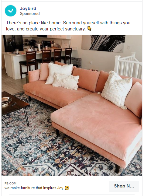
This ad by Joybird features several of their products within a single photo. The whole vibe of the image looks cozy and inviting. Exactly what a home should feel like!
58. Parachute Home
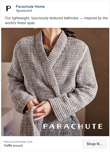
You don’t have to be boring when talking about the reliability of your product. The words ‘inspired by the world’s finest spas’ are interesting and conversational.
59. Thinx
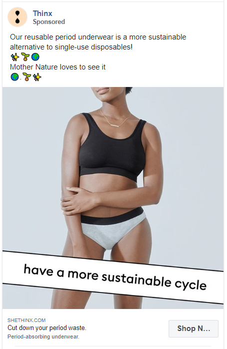
Thinx have created a simple ad that is full of meaning. It talks directly to the target audience. By including words like sustainable and mother earth they are pulling on all our emotions.
60. Dropps
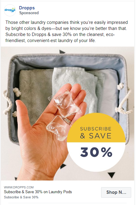
Ego baits are real and they do work. Dropps know what they are selling and how that is different from all their competitors. Just by telling the readers that ‘you are better than that’, they have promoted their eco-friendly laundry pods.
61. Topman
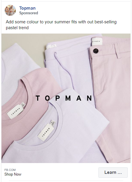
Another example of a minimalistic Facebook ad. Topman is promoting its top-selling pastel clothes with the product image and just their brand name in the graphics.
62. Undress
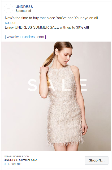
The copy in this ad is simple and convincing. It focuses completely on the customers.
63. Yeti
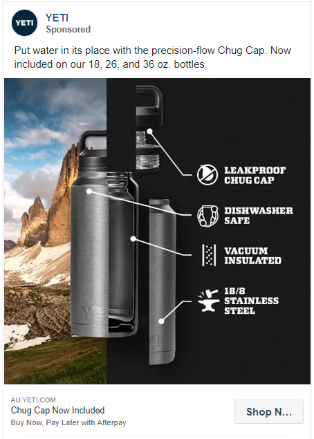
The ad creative in this Facebook ad example is enough to motivate someone for buying. They could have just mentioned these features as bullet points but instead, they took a very creative approach.
64. Puma
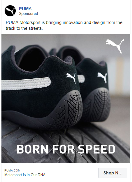
Puma used a zoomed-in picture for their ads to show the real details. And to make this ad more powerful, they added a tag line.
65. Colgate
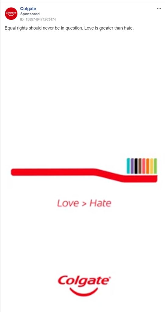
Colgate ran this ad to show their support for the LGTBQ+ community. Even though they used their product in the graphics, the ad itself gave them credibility in this support.
66. Ralph Lauren
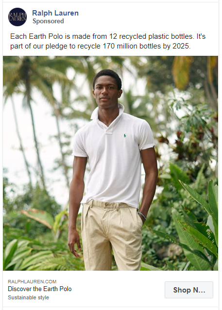
Ralph Lauren knows how to be eco-friendly. And they know how to highlight this USP in their Facebook ads.
67. Intel
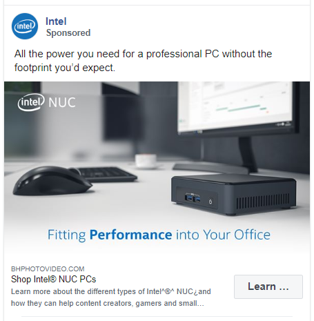
Intel is promoting its product without telling a lot about their complicated features.
68. Canon
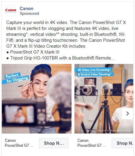
Don’t get me wrong, I do love some quirky one-liners. But you should definitely experiment with some long and detailed captions. Like this one from Canon tells you everything you should know about their product.
69. Warby Parker
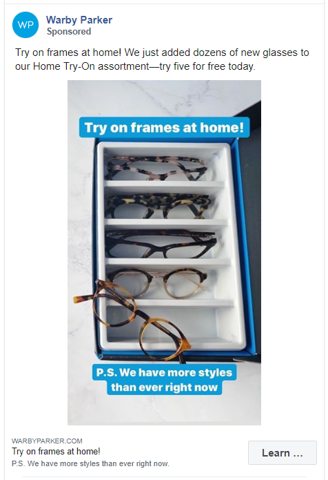
The caption ‘Try on frames at home’ is repeated 3 times in this ad. Talk about making yourself heard.
70. UNTUCKit
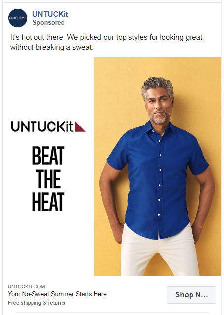
UNTUCKit shows how a basic product photo on one side alongside some compelling copy works wonderfully to attract new customers.
71. Ted Baker
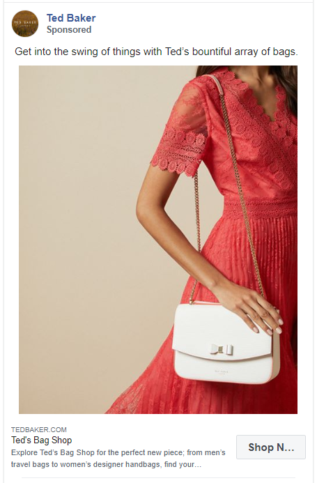
This simple and light-hearted ad by Ted Baker doesn’t demand too much from the readers. They haven’t even mentioned any feature or USP of their product.
72. CLUB MONACO
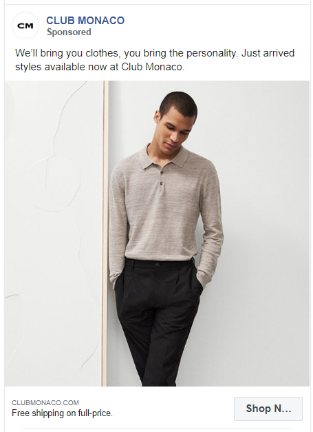
This ad shows you how to include your customers into the copy. Plus, their graphic is just a simple picture of the product without any text.
73. Macy’s
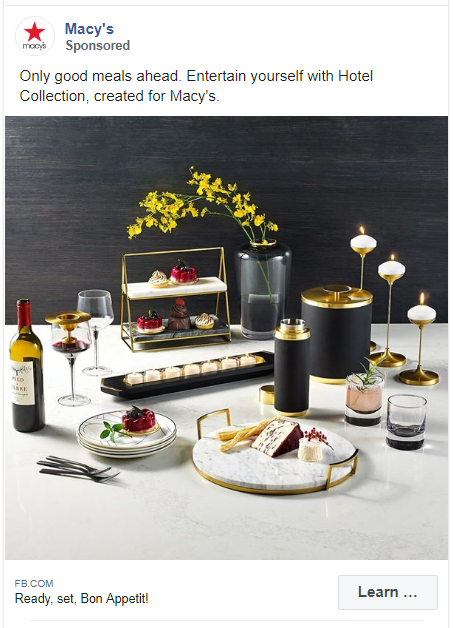
Macy’s have presented not one but multiple products in just one picture. The colors and aesthetics of this image is enough to entice the audience.
74. French Connection
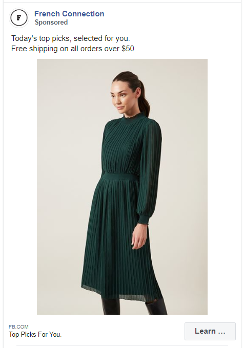
This is another example of an ad that talks directly to the audience. The words ‘selected for you’ add a personalized and humane touch to this caption.
75. Trendy Butler
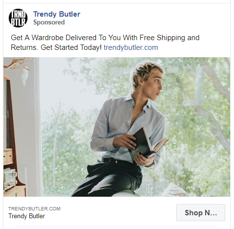
Trendy Butler have also tried to use the two links variant in this ad. The user can go to their website by clicking on the button below the app or directly from the caption. This can work to improve the ROI of the ad significantly.
76. Rocksbox
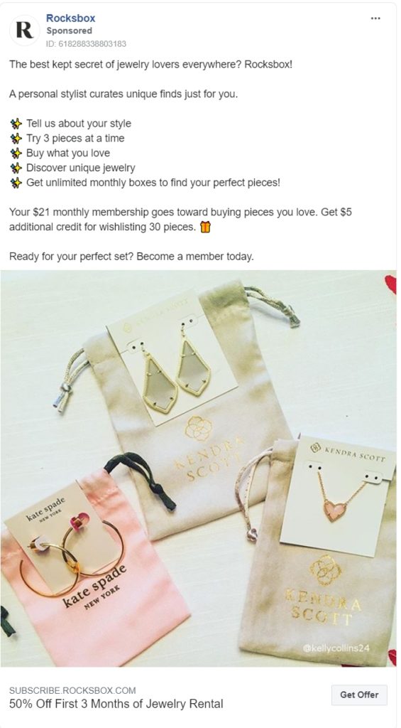
Rocksbox revealed all their cards in this advertisement. Starting with a simple question, they have explained how you can get a curated box, and how much will it cost you.
77. Loot Crate
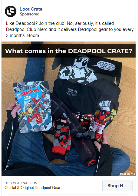
This is probably the most casual way of asking someone to join a club. And it works!
78. ALDO Shoes
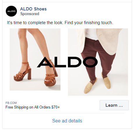
This is not a carousel ad but it sure looks like one!
ALDO has just added their brand name on top of two of its products. Since they added shoes for both males and females, they won’t have to run multiple variants of this ad.
79. Bespoke Post
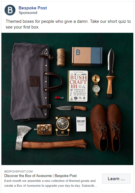
This Facebook ad also doesn’t sell the product directly. They aren’t telling you to buy your themed box but asking you to see what it has.
80. Mango
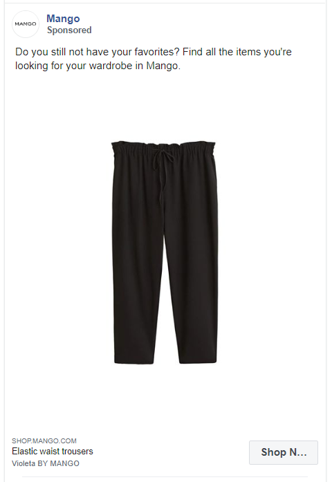
This is a rather unique e-commerce ad on this list of Facebook ad examples. Most apparel brands use models to show their clothes. It does work but there is always room to experiment.
Mango hasn’t used any models but just a picture of their product with a white background. How does this work? Your audience isn’t distracted by anything, all they see is your product.
This is a great example for small businesses who don’t have the budget to hire models.
81. FabFitFun
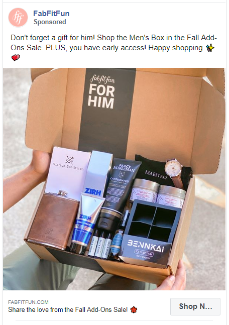
Another Facebook ad with an unedited image. It shows real products in the hand of real people. Plus the caption is very encouraging.
Beauty Facebook Ad Examples
The beauty industry includes cosmetics, fragrances, skin and hair care brands. Although it focused only on women earlier, now this industry has become more inclusive of all genders.
The following Facebook ad examples from the beauty industry really stand out from their competitors. These ads incorporate fun graphics, simple captions, and clear CTAs.
82. Sephora
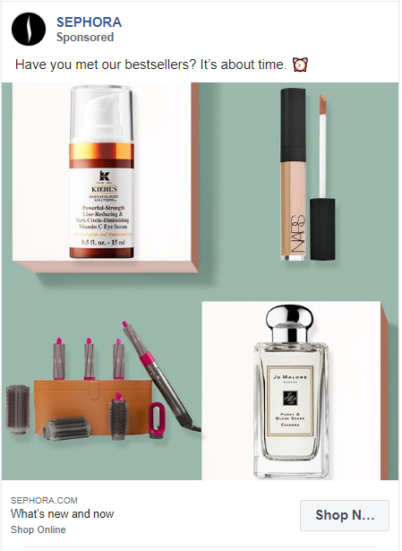
This ad by Sephora is simple yet so brilliant. The caption tells you to meet the bestsellers and the graphic features photos of their 4 bestsellers.
83. Bath & Body Works
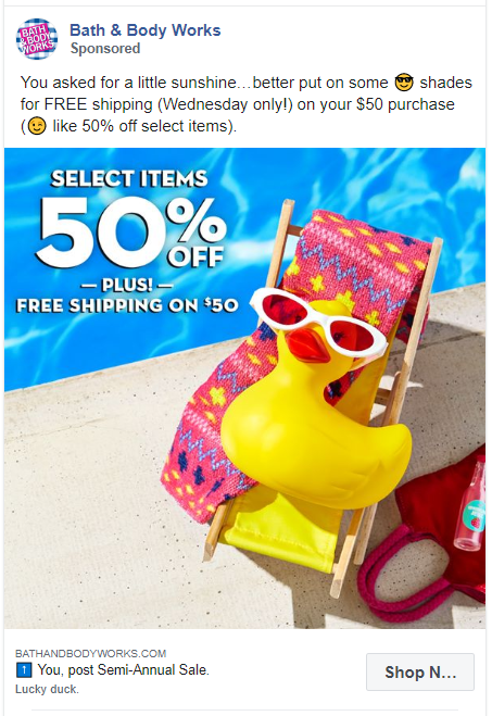
The bright colors and creative image of a rubber duck are eye-catching. The caption is loud and clear about their latest offer.
84. Olay
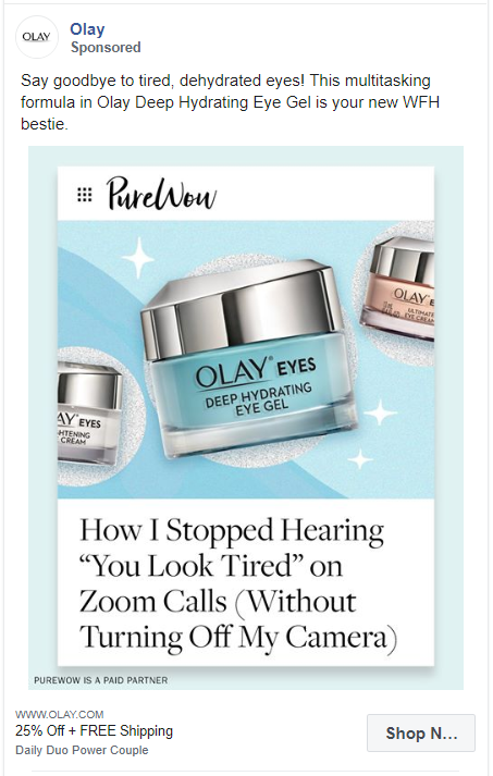
This testimonial ad from Olay uses direct quotes from customers in the ad graphics with their product. They have further explained the features of their product in the caption.
85. Fenty Beauty
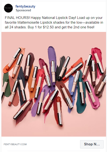
Most brands create ads around major holidays but it can be just as beneficial to do this around other national days.
Fenty Beauty is promoting its lipstick on National Lipstick Day with a colorful picture. They have also declared a special offer for their customers.
86. Elizabeth Arden
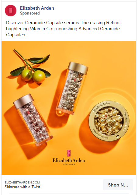
We have another ad with a bright colored background and the images of the products. This ad by Elizabeth Arden talks straight to the point, 3 products, their pictures, their name, and their features.
87. Glossier
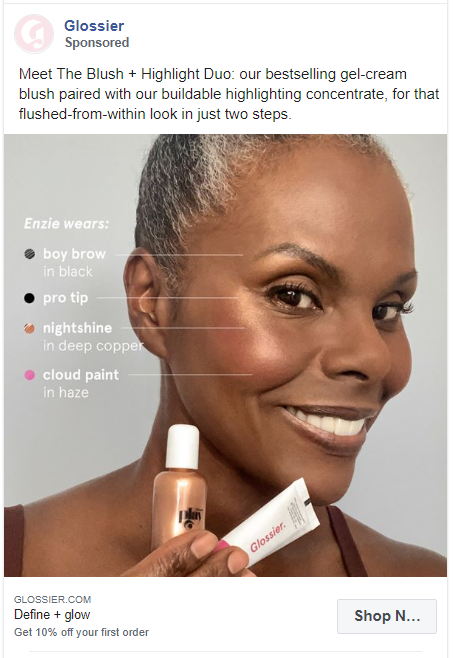
Real people + your products = successful advertising.
It is interesting to see how Glossier has shown multiple products on one face.
88. Herbivore Botanicals
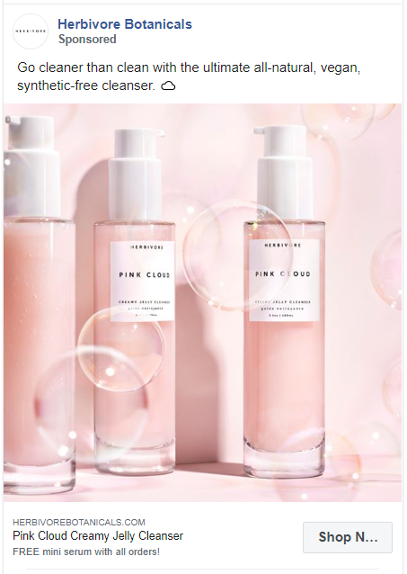
This ad focuses on pastel colors and clean design that does go well with their tagline ‘Go Cleaner’. Plus, the caption makes sure to tell the users how good this product is.
89. Credo Beauty
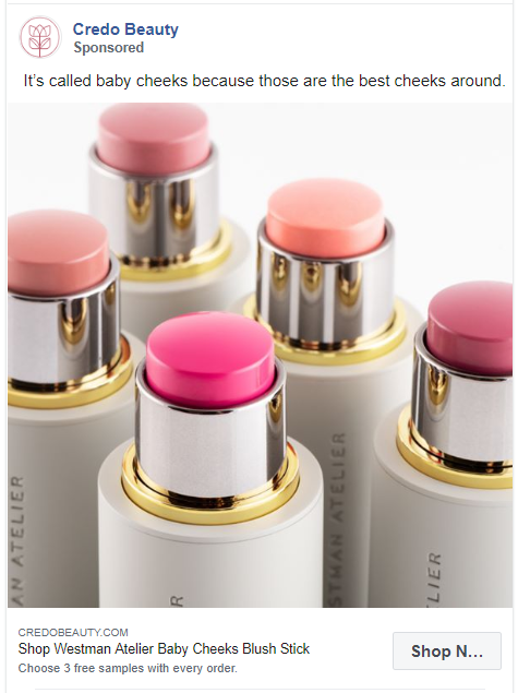
After Fabletics, this is my favorite caption on this list. It is both glamorous and enticing.
90. Lola’s Lashes
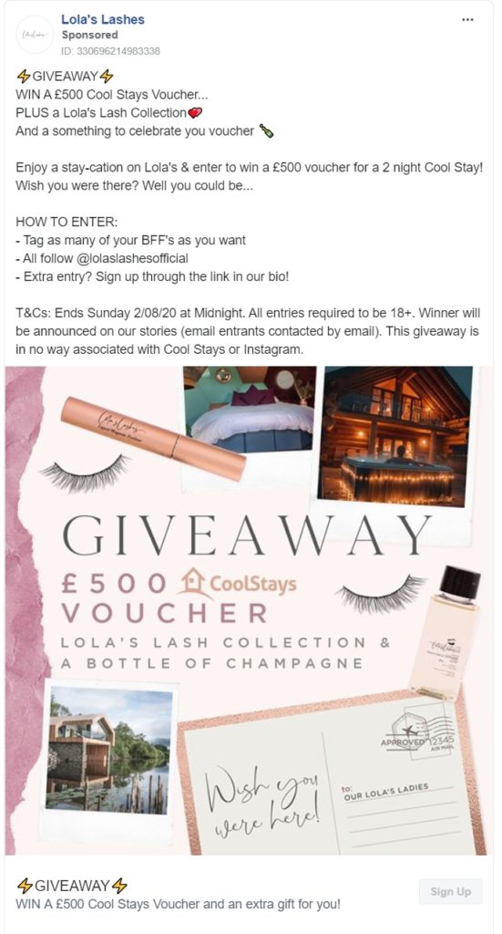
Running ads for giveaways is becoming very popular.
This ad is here to teach you how to do it successfully. Start by telling your audience what you are giving away, add the rules, and all the terms and conditions. Then finish it off with a great image.
91. Estee Lauder
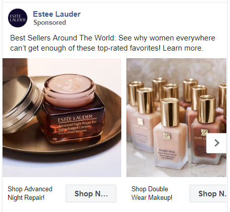
Estee Lauder made a carousel ad with single images of their best selling products. The high-quality images they have used in this ad are enough to get them sales.
92. Pipette Baby
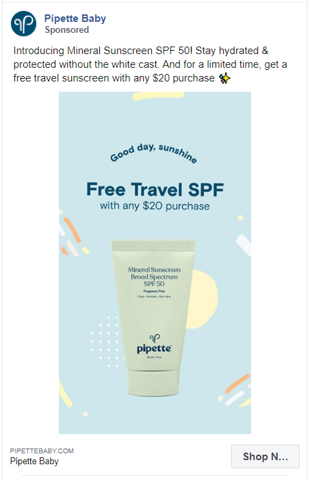
Just like Philips, Pipette Baby has also focused their ad on their free gifts and not the actual product. The image of this ad also looks very interesting with the background and different styles of text.
93. La Roche Posay
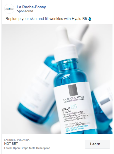
This ad highlights customer benefits that are derived from the products. It also features a good quality image of the product.
94. Caudalie
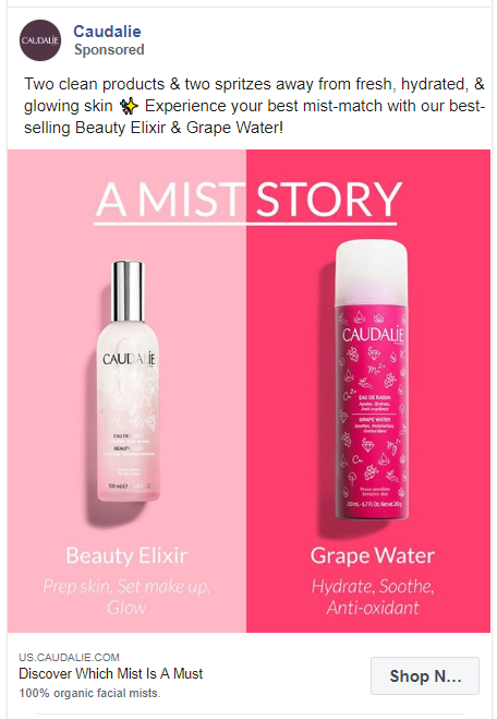
Caudalie is selling not one but two products in one ad. They have presented these products in a way that the audience knows how they can be used together. The caption is also creatively written with great puns like mist-match.
95. Sisley Paris
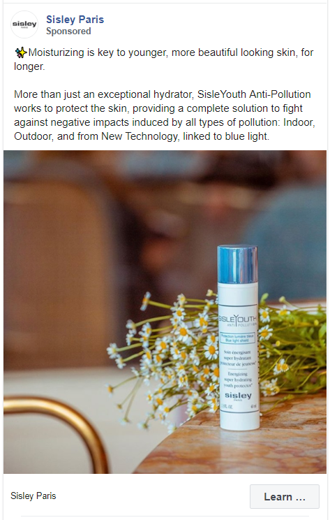
The product image in this ad is very different from other images in this list of beauty ads. Instead of a zoomed-in picture, they have used a zoomed-out version. The caption is also quite long as it explains in detail what the product does.
96. Lancôme
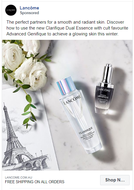
In this ad, Lancôme is selling a new product with an already existing cult favourite product. They are selling it as a duo and telling the audience how they can use these together.
Software & Service Providers Facebook Ad Examples
This section features the best Facebook ad examples from SaaS (Software as a Service) companies and service providers. Here you’ll see a variety of ads in which the companies or the individuals are either promoting their services or their blogs.
97. Human Interest
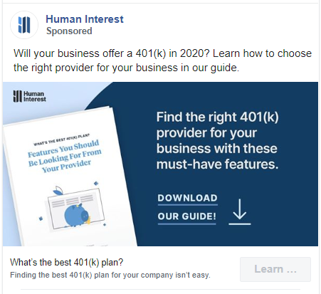
One of the best things about this ad by Human Interest is the CTA in the graphic. It doesn’t just tell you to download the guide but the arrow navigates you how to do this.
98. DocuSign
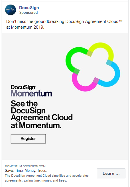
Another minimalist Facebook ad example on this list. It includes the name and logo of the brand with the purpose of the advertisement.
99. WordPress
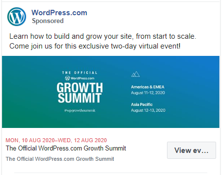
WordPress is advertising an event here. They have mentioned everything about the event from the dates to location and what you’ll learn in this Summit.
100. G2
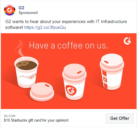
How you are offering something is just as important as what you are offering. G2 could have just mentioned that they are giving away a Starbucks gift card but instead, they added a personal touch to the copy.
101. Xero
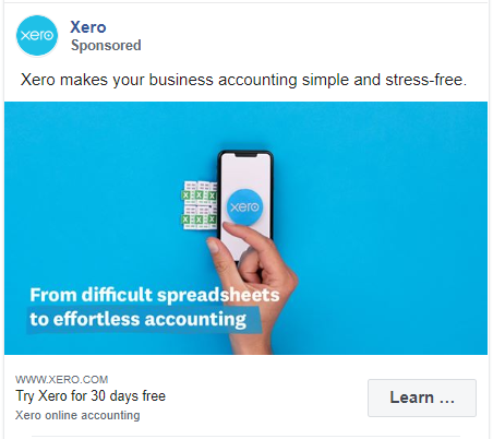
This ad explains what the business does in just a few words. Plus the text in the caption and the graphics are complementing each other perfectly.
102. Pipedrive
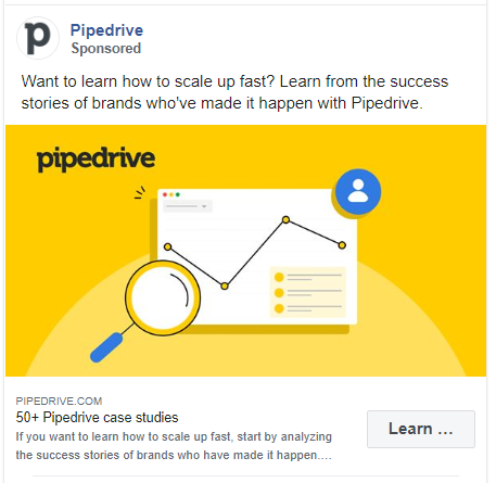
Pipedrive is promoting its case study article with a simple caption and a well designed creative.
103. MailerLite
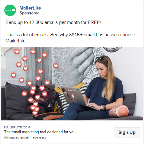
Think about this for a second: Send unlimited emails for free vs send 12000 emails for free.
Which one sounds more authentic?
MailerLite also mentions the number of their existing clients which looks even more impressive to their audience.
104. Shopify
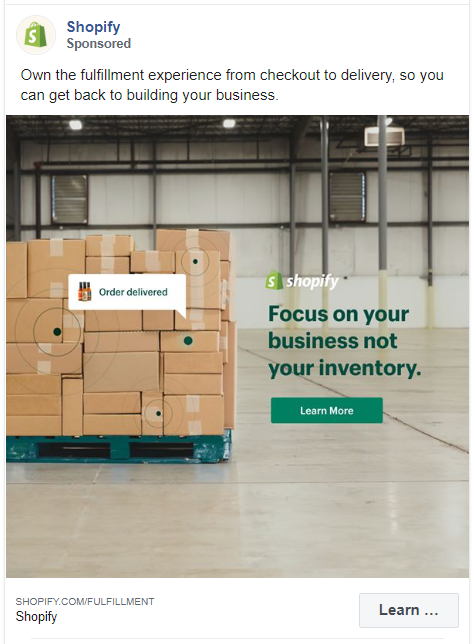
Shopify has taken this stock photo to another level by just adding some text. Their copy is enough to explain to the reader what they are providing.
105. Toptal
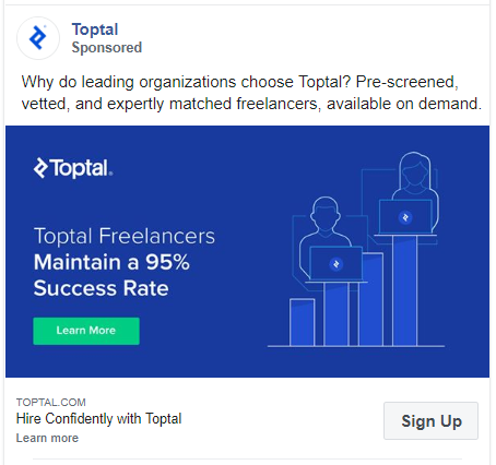
Why do we love this ad? It mentions all the products features, uses the exact percentage quantity, and has a simple visual.
106. Progressive
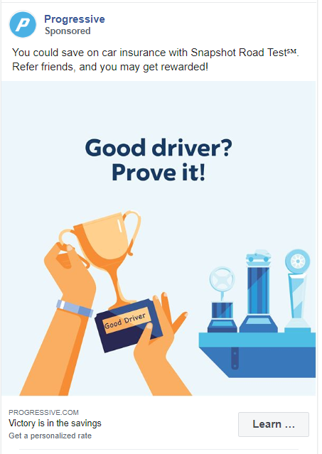
Progressive is an insurance company and they are selling their car insurance in this ad. Although their graphic alone doesn’t convey this message but it is compelling enough to make someone stop scrolling.
107. Amy Porterfield
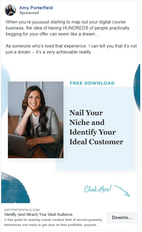
Another ad with a great CTA. Adding a simple arrow to your graphic might not look much but it does work and increases your ROI.
108. ClickFunnels
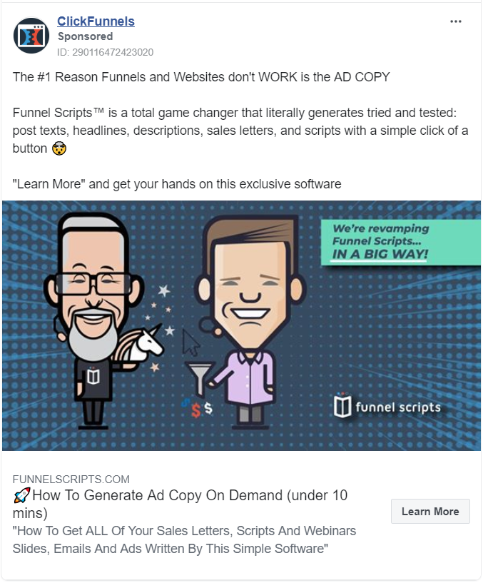
They ran an ad for something that will teach you how to create ads. Brilliant!
109. Squarespace
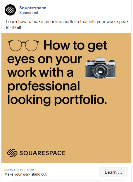
The first thing you see in this ad is the bold text in the image. They haven’t even used some fancy tools to design this. You can easily create this ad from any social media graphic design tool.
110. Fiverr
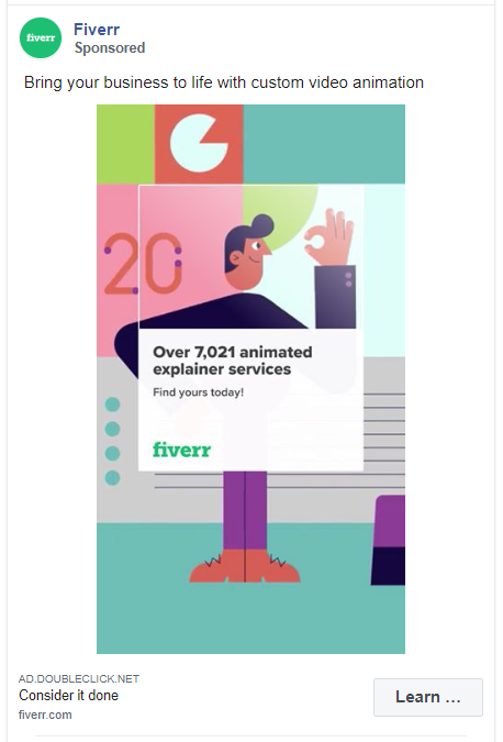
A good-looking illustration that shows the value of your product is enough for a profitable Facebook ad.
111. Brian Tracy
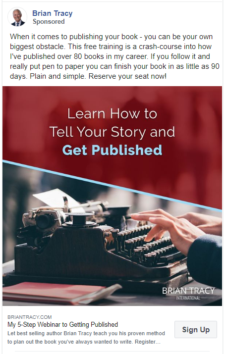
Another simple ad by an individual. The caption is straight forward but very smart. Just by mentioning that he has published over 80 books he has gained a lot of credibility for his audience.
112. LinkedIn
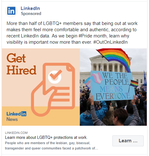
Yes, even other social networking sites use Facebook ads to reach their audience.
LinkedIn have focused this ad for a particular community but by doing so they have gained positive points from everyone else.
113. Magento
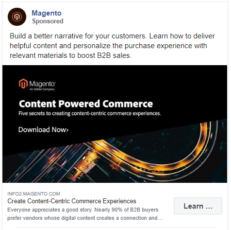
The heading in this ad ‘Create Content-Centric Commerce Experiences’ is very specific and lets the audience know exactly what they’ll get by clicking the ad.
Their copy and image text is also short, simple, and very matter-of-fact.
114. Venngage
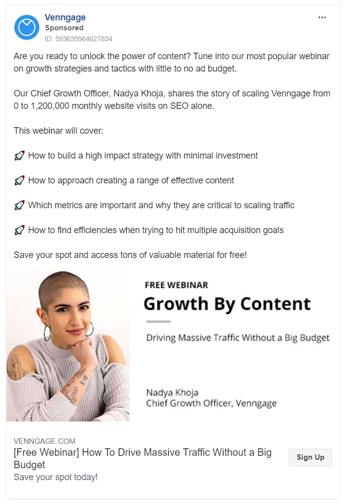
Another detailed and spot-on ad by Venngage. They are promoting a webinar and they have mentioned everything that would be included.
115. Thinkific
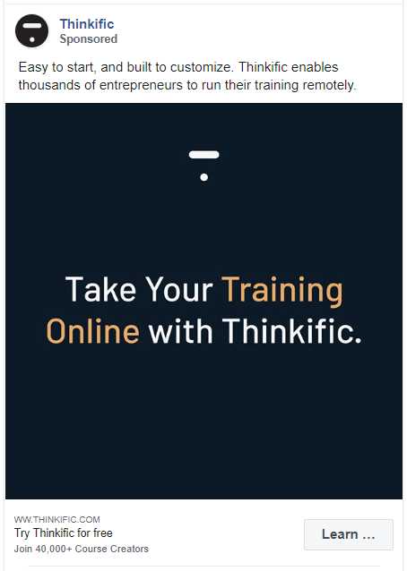
How easy is it for you to create a similar ad like this? Thinkific explained everything in their caption and used the graphic to write their CTA.
116. Yoga International
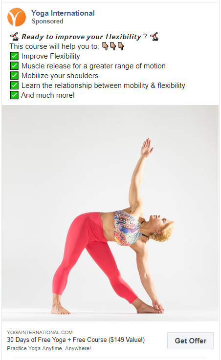
An ad full of emojis will never fail to engage with the audience. Plus, for their visuals, they have used an image of a woman with no extra text or distracting background.
117. Whatagraph
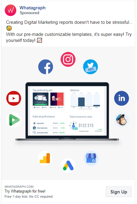
The use of icons from the famous brand was the first thing that got my attention. Even though the visuals don’t really give an idea about the company but the caption tells the audience everything they need to know.
118. Biteable
Biteable has made a video ad with an image of a dog. You can do this too with any stock image.
Also, in their caption, they have given an insight about how popular they are.
119. EmberTribe
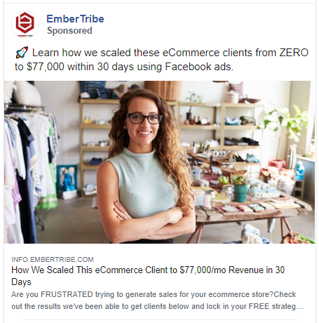
I know I am repeating myself here but using numbers attracts more people.
EmberTribe could have written that they will teach you how they scaled their eCommerce client. But by adding the exact number they have proven their authenticity.
120. PSECU
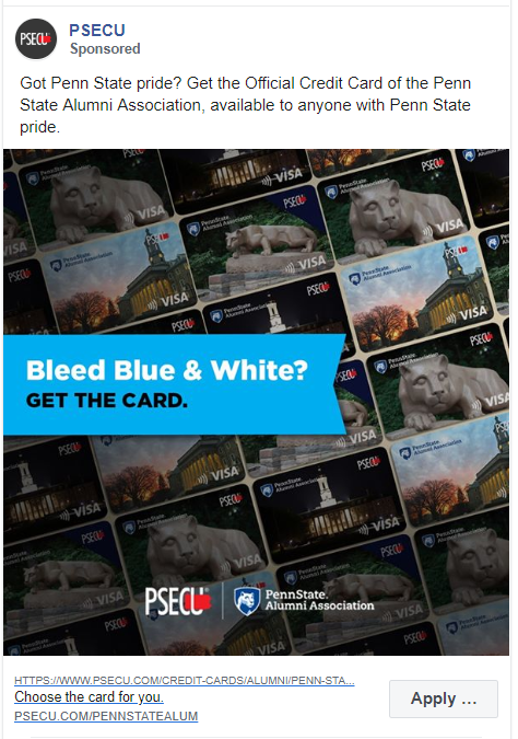
The image might look too complicated to some but I really like a creative background. That with a perfect caption just seals the deal!
121. Ahrefs
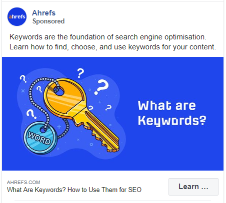
Ahrefs has got their branding game right!
The bright blue color is their go-to for everything from logos, to blog images and ad creative. Also, the clever illustration makes you want to click.
122. Shutterstock
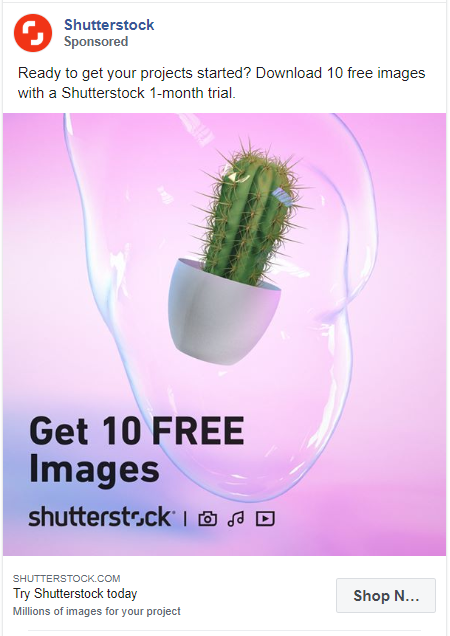
A cactus inside a bubble might be alarming for some but it definitely catches attention. Shutterstock is using this ad to promote a 1 month free trial of their services.
123. 17Hats
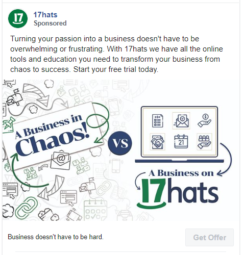
Another self-explanatory graphic. 17Hats have kept both their caption and image simple but very descriptive. They want to make sure their audience knows what they are getting.
124. Omniconvert
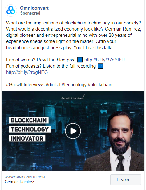
This was a video ad. But more the video I wanted to show you the caption of this Facebook ad.
They are actually promoting not one but 2 things here. You can read their blog or listen to their podcast.
Ideally, most people focus on offering just 1 thing but there are no restrictions. You can try and work multiple angles in your Facebook ad.
125. Eventbrite for Organizers
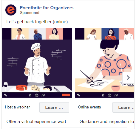
A carousel ad with fun and creative illustrations. This ad doesn’t have many words but their graphics convey the brand message easily.
126. Sonarworks
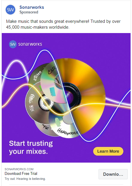
If Facebook users only see images while scrolling then this ad will not disappoint. And once they are drawn in, the headline, caption and the image text will guide them through smaller, actionable steps.
127. AppSumo
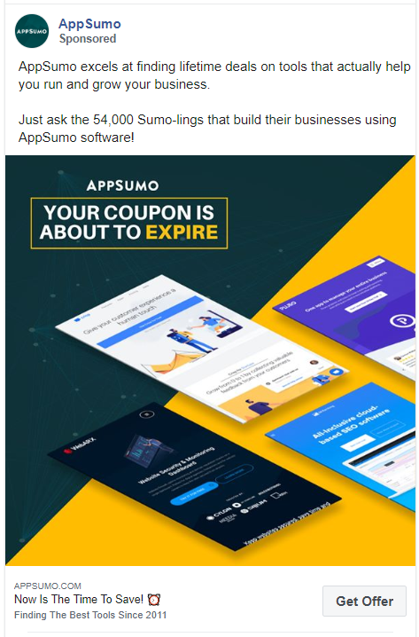
Multiple images added into this one image brings great vibrancy and contrast to this ad. The caption is also very engaging and features great call-to-actions.
128. Bluehost
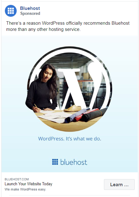
Yeah, I thought it was an ad for WordPress too! That is a pretty smart way to catch someone’s attention to your product.
129. SiteGround

Another hosting service ad, very different from the one above. This one is more simplistic and on-point with both the caption and the image.
130. Bolt
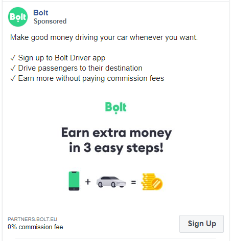
Bolt does a great job of speaking to its core audience. They address the biggest struggles of their customer i.e. money.
Tiny avatars of phone, car, and coins in the graphics are self explanatory. The caption also breaks down this process in 3 simple steps.
131. Canva
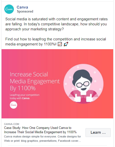
Canva is promoting a case study about how a company increased their social media engagement using Canva. The ad copy itself does a great job of leading the audience through the customer value journey. It starts with awareness, asks a direct question, and then gets them to convert.
132. Tiktok

It isn’t a video ad, TikTok used this image for their Facebook ad. There is no way someone won’t stop scrolling for this.
133. CB Insight

In this ad, CB Insight is telling the audience what every C-suite executive is thinking. It tells the audience to watch out for the latest cybersecurity trends.
It also adds a FOMO by showing what is included in their reports and what you’ll be missing out on if you don’t download it.
134. CoSchedule
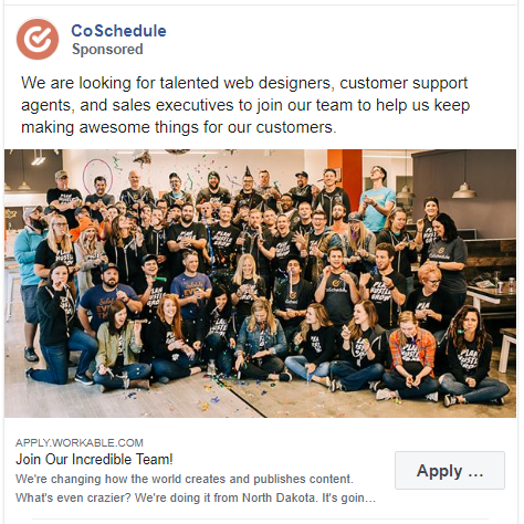
This is a hiring ad by CoSchedule. Instead of using a generic illustration or stock image, they have featured a photo of their team. It does a great job to showcase their company culture and does make the applicant sign up.
135. Flywheel
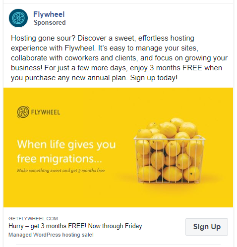
This ad displays fine creativity. Using lemons in the graphics and personalizing the classic ‘If Life Gives You Lemon’ phrase is what makes this ad so great. Also, to relate this to the caption they created ‘Hosting Gone Sour’.
136. Square
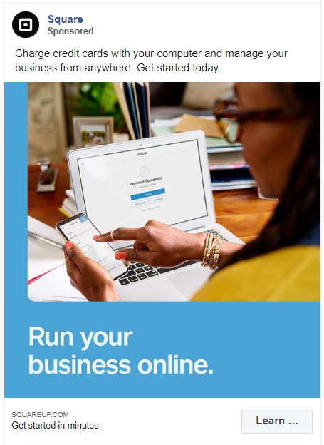
This ad added some text to a simple stock image. What’s great about this ad is the caption. It’s simple and to the point, exactly what the customers want. The CTA is also effortless.
137. Fundrise
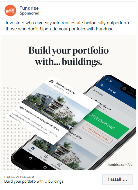
This ad aimed at investors tells them why they need to use Fundrise in a very cool way. If you want to ‘historically outperform’ your competitors you need to upgrade.
138. Help Scout
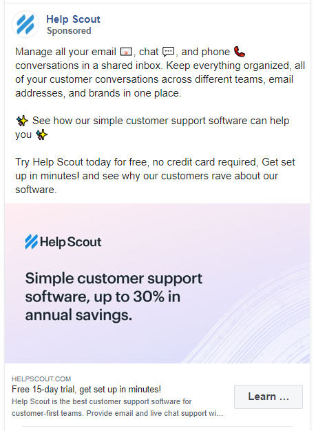
Most business owners struggle to manage their emails and chats. Help Scout is offering a solution to this problem. They have added multiple CTAs in the caption to encourage the readers to sign up.
Also, in the graphics, they mentioned that the readers can save upto 30% on your annual savings. This is a great way of making the viewers feel the value of your product.
139. Lyft
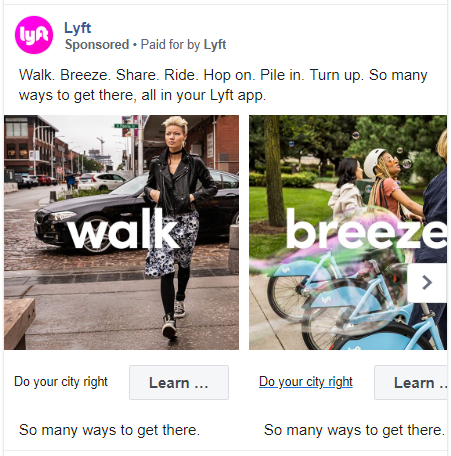
Lyft is a ridesharing service in the USA. They have created an unorthodox carousel ad to promote their app.
140. Intercom
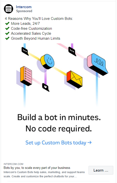
Intercom doesn’t mess around – their ad goes straight to why you’ll love this product. The creative adds a great CTA and even the heading points out more features of this product.
141. Thumbtack
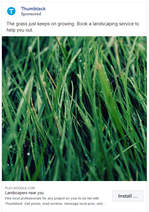
Now this is what we call an effortless ad. Thumbtack has used a no-brainer graphic for this ad. The caption also is very simple. This ad can also serve as a reminder to the audience that they need to do something about the lawn grass.
142. KlientBoost
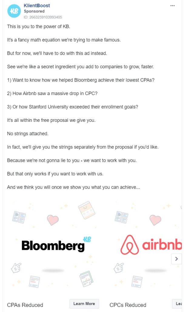
This is a pretty long but effective ad copy. Plus, they have made a carousel ad using the names of the big brands they have worked with.
143. Later
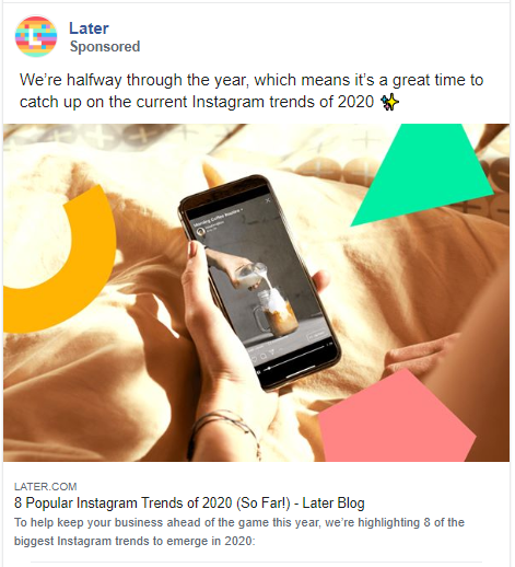
Later is an Instagram scheduler & social media platform. In this post, they are promoting one of their blog posts about Instagram Trends. They have used a simple stock image and added some personalized shapes that better represent their brand.
144. Marketo
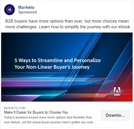
This is a lead magnet advertisement. It allows the reader to download an ebook. Marketo have kept it simple by mentioning what the ebook is about both in the caption and the graphic.
145. Sproutsocial
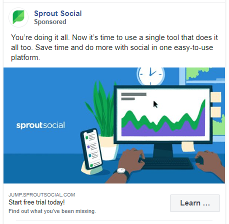
Unlike other similar services on this list, Sproutsocial is directly selling their services. The creative they have used features a vector image with the brand name. The CTA is written in the heading.
146. Mathnasium
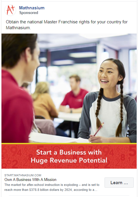
This is another Facebook ad example that has used a stock image with some text. It might not be the most effective way to advertise but it is a simple and quick.
147. N3TWORK
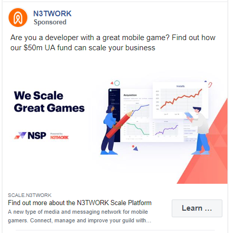
N3TWORK has targeted this ad to a very niche audience. They have shown their credibility in the caption. Also for the creative, they have used a vector image that you can easily find on Freepik.
148. Leadpages
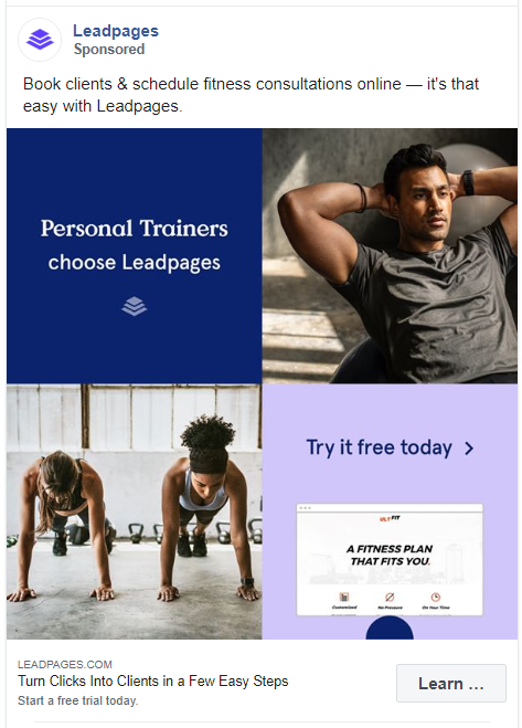
Leadpages have put real thought into designing their ad creative. They have used 2 stock images and 2 CTA. Their caption and the heading are also CTAs. Looks like they don’t want to miss out on any opportunity here.
149. WestJet
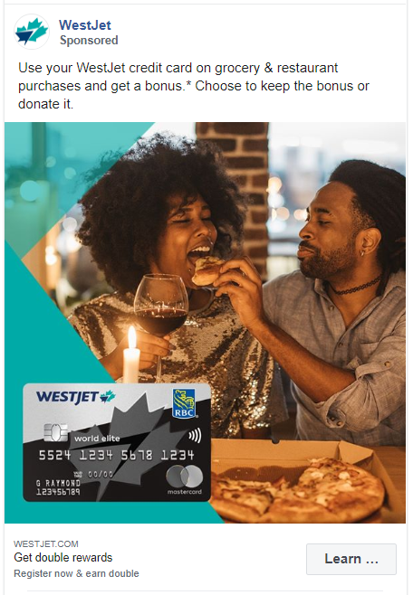
WestJet is promoting their credit cards in this ad. They have used a stock image with their product. The caption immediately hits on the main points the reader should know.
150. OpenTable
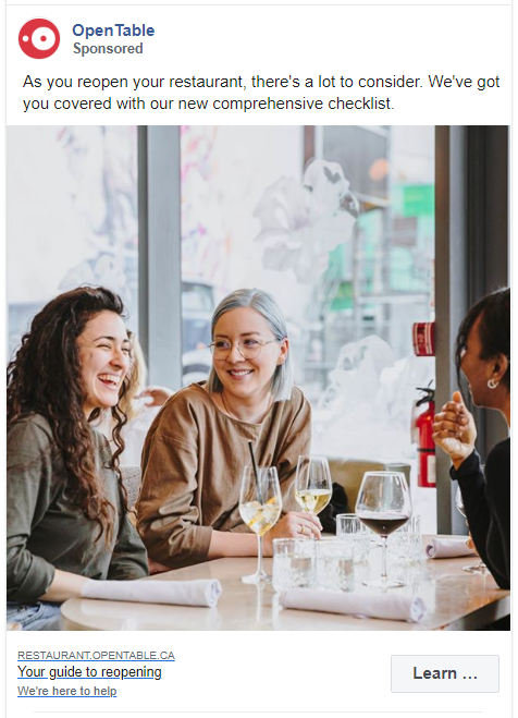
This is a post pandemic lockdown ad. OpenTable is an online restaurant-reservation company but they are running a lead capture ad.
The ad mentions what they are offering, why you need it, and they have accompanied it with a simple stock image.
151. PayPal
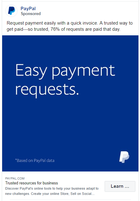
This ad aims to solve the biggest problem of business owners when they are looking for payments of their work. It tells the users how they can request payments and uses a percentage to prove its credibility.
152. TrueCoach
TrueCoach has put all their efforts into the ad copy and just added their logo in the image. Does it work? You tell me.
153. Peakon
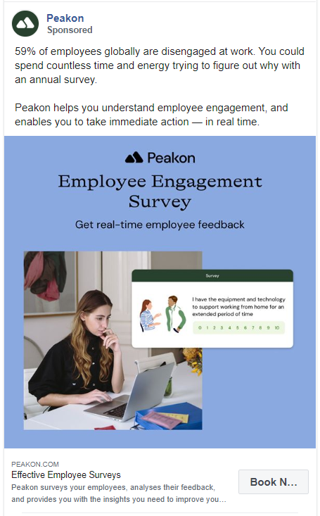
This advertisement uses the AIDA model. With the very first sentence, Peakon has successfully grabbed the attention of the readers. Their next sentences create interest and desire to try this service. Their creative and ad heading tells the reader to take action.
154. Compassion International
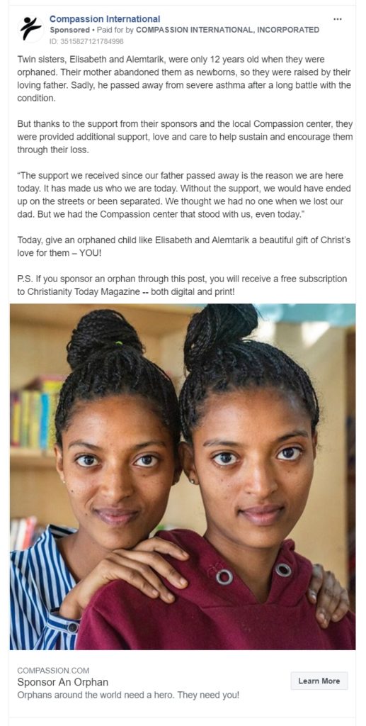
This is an ad for an aid organization. Instead of asking you directly to sponsor a child, they have featured a story of two orphans. It works by making the audience more emotionally attached to this cause.
155. Packlane
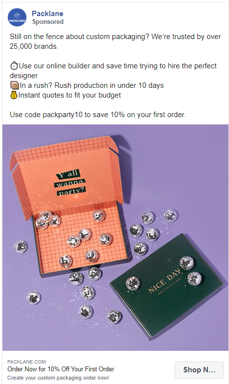
Packlane offers quite a unique service of designing your own custom packaging. They have added almost everything from customer’s proof to a coupon code in this ad.
156. Scoro
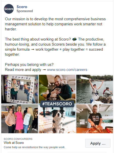
Another hiring ad on this list of Facebook ad examples. Scoro has also shown the photo collage of their team members cooking, rafting, playing, and doing everything apart from working. I would like to apply here!
157. WalkMe
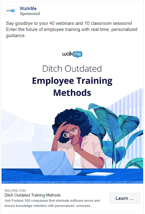
The customized illustration is one of the best things about this ad. WalkMe has also added some text about their services with this illustration to make this ad more appealing.
158. Salesforce
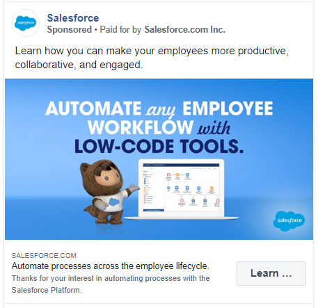
Salesforce is another big brand that keeps its Facebook ad quick and to the point. They find success in a simple caption and an ad creative featuring Astro.
159. Freepik
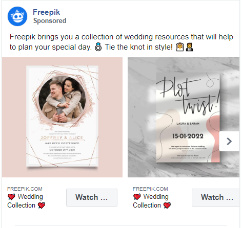
Almost every online business owner has used Freepik. They offer millions of free graphics resources to their audience. But in this carousel ad they are just promoting their wedding collection.
They have crafted a creative caption and added images of a similar color scheme to maintain harmony. Also, they have used emojis in the caption and in the headings to grab more attention.
160. HubSpot

HubSpot has advertised their playbook in this Facebook ad. They have touched upon the subject of how much the reader will benefit from this by saying ‘…help you sell better, even from your couch’. The ad creative is also very simple yet creative.
161. Russell Brunson
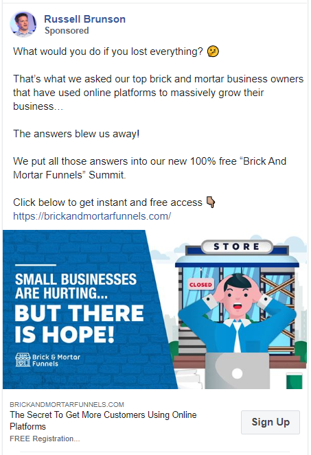
Russell Brunson is the co-founder of ClickFunnels. He has used a long copy to promote his product with an engaging image. He has also added an extra link to his website in the caption.
162. Veeam Software

This ad is here to teach us how to show reliability of your software. Veeam Software develops backup, disaster recovery and intelligent data management software for various infrastructures. Instead of adding a testimonial from their clients, they have mentioned a proof.
Even in the creative, they have focused more on the text than the image.
163. Ryanair
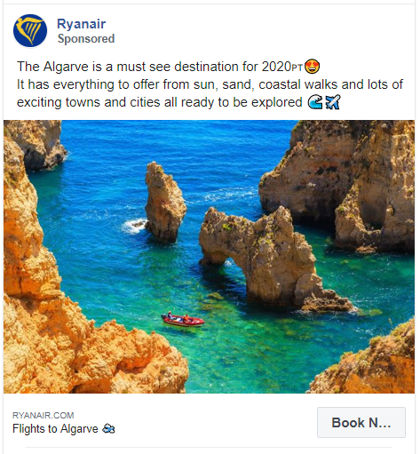
Even though travelling is very restricted in 2020, Ryanair airline is advertising about Algarve, a southernmost region in Portugal.
They have used an image of the region. But in the caption, they have not used a direct CTA to book a flight. Instead, they are telling the readers what’s so great about this travel destination.
164. GetResponse
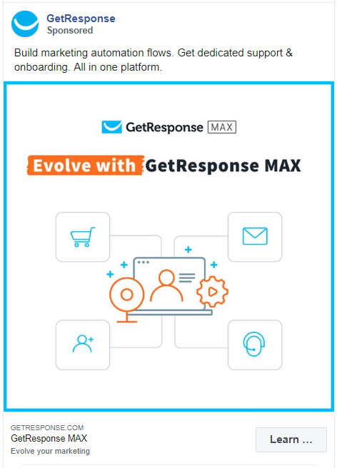
GetResponse has used a clean image designed with icons. The text of the ad tells its audience what they can do with this software and why is it unique.
165. Tinder
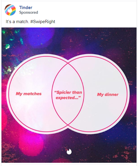
These are the only Venn diagrams we need in our life. Tinder has created an ad for just brand awareness, there is no CTA in this ad. The caption says Tinder’s iconic phrase and the image is totally shareable. It’s an ad created with the intention of going viral.
166. Hootsuite
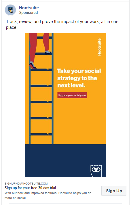
This is another one of my favourite Facebook ad examples in this list.
Hootsuite kept the copy simple because it’s the image that shows their artistry. With a play of words ‘Take your social strategy to the next level’ they have added an image of a person climbing up the ladder ‘going to the next level’.
They have used a great CTA in the ad creative and the heading.
167. Visa
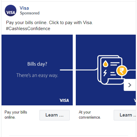
The carousel ad by Visa has a beautiful flow between every image. The caption is their catchline ‘Click to pay with Visa’ with a hashtag.
Using these hashtags in your Facebook ads you can boost your clicks and lower your CPC.
168. Waze
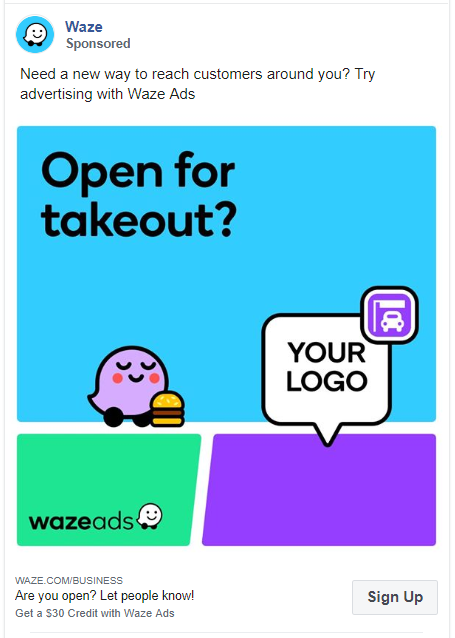
Waze owned by Google is an advertising platform designed to promote physical stores. They have used their unique branding colors in this Facebook ad. This brightly colored ad pops off the page and grabs users’ eyes.
The ad copy is simple and features a clear CTA.
169. VISME
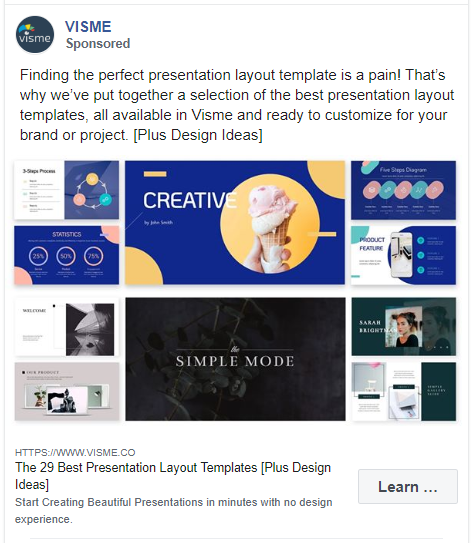
VISME offers professional presentations and infographics templates to its users. They have featured not one or two but ten of these templates in their ad creative.
Their ad copy is also very detailed and tells the reader about their collection of best presentation layout templates.
170. Qapital
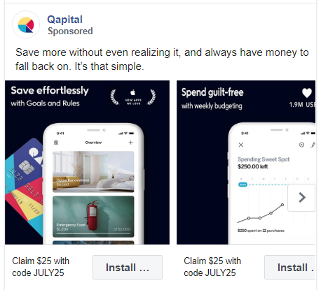
This is another carousel ad by Qapital, a personal finance mobile app.
Everyone wants to save more money without any pain. Qapital is claiming to do just that in this Facebook ad. They have used screenshots from their app as the images of this ad. Also, they have added a coupon code in the heading.
171. FIDELITY
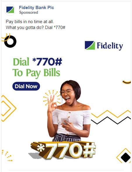
There is too much happening in the image of this Facebook ad. But it can work great to grab users’ attention. Also, to balance this out, they have kept the caption very simple.
172. Quicket South Africa
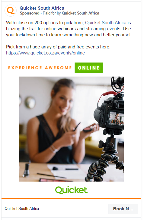
Quicket is a platform used to create fundraisers and events. But since there are no events happening due to COVID-19, Quicket has started organising virtual events and webinars.
They are promoting this service with a simple stock image and an engaging caption. Also, take note of how many times they have added a link in this ad.
173. Personal Capital
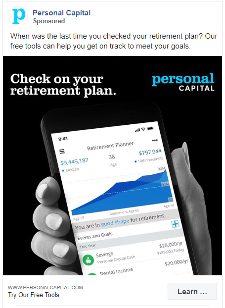
This online financial advisor and personal wealth management company is promoting its services using Facebook ads. Their ad creative really pops out because of the black background. Yet the image is just a screenshot of their app.
174. Prezi
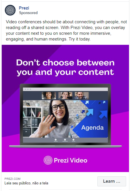
Prezi is a presentation software that is advertising one of its coolest features in this ad. They have kept the copy of this ad detailed but to-the-point. The creative also uses fun bright colors that grabs the attention of the users.
175. Anchor
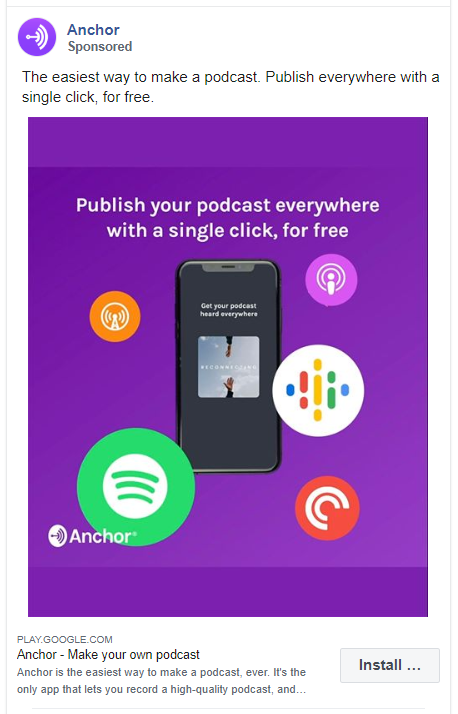
Just by a glance at this ad, you’ll know what Anchor does. They have their copy so precise and to the point.
They have also repeated the same text in their caption and ad creative for maximum impact.
176. Wealthfront
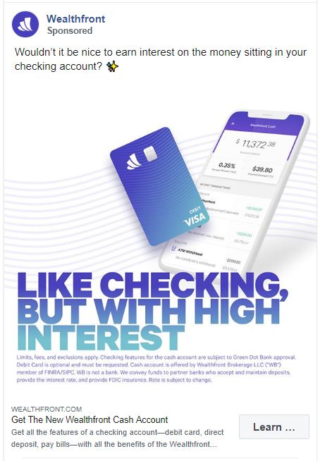
Wealthfront is an investment service firm and they are asking the users to get a new cash account from this ad. They have added all their terms and conditions in the creative of this ad. What I like about this ad is the caption. It’s an engaging question for their target audience.
177. Robinhood
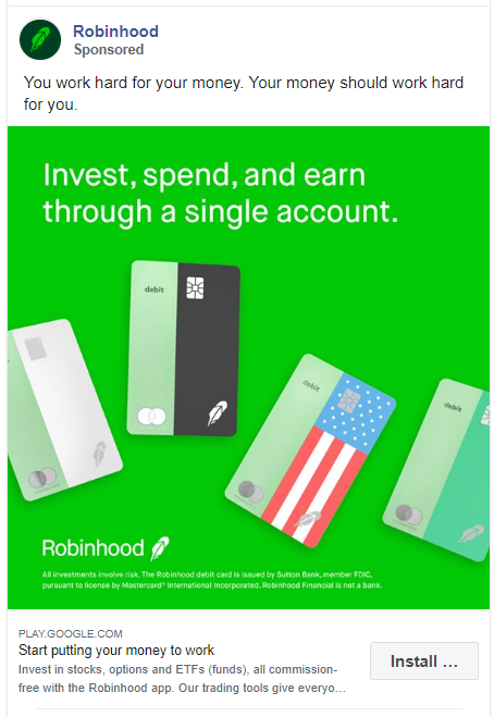
Robinhood is another financial services company on this list of Facebook ad examples. What they have used in the caption is not their original phrase but it definitely is catchy. The image uses a bright green background to pop out from the others.
178. COINBASE
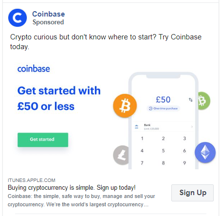
Coinbase allows its users to buy, sell, and store cryptocurrency easily. This ad is very targeted and to-the-point. The image of this ad also features an attractive CTA.
179. Azendoo
We have seen similar Facebook ads in this list where the company just uses its logo in the creative. But what’s so great about this ad is the caption. It’s the most unique, fun, and curious one-line phrase.
180. GitLab

GitLab is promoting their webcast in this ad. They have used a bright colored image to grab people’s attention along with a simple caption.
181. Teamwork
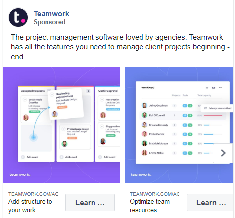
Teamwork has made a carousel ad featuring screenshots of their software. It helps the user’s see how they can use various functionalities of the tool.
182. Atlassian
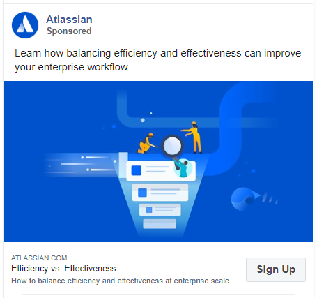
Atlassian is another software development and project management tool on this list. They are asking people to sign up for a webinar about balancing efficiency and effectiveness at an enterprise scale. They have used a customized vector image for this ad.
Education Facebook Ad Examples
This category features the most successful Facebook ad examples from various online learning platforms. These organizations are promoting their programs, courses, and even webinars in the following ads.
183. Khan Academy
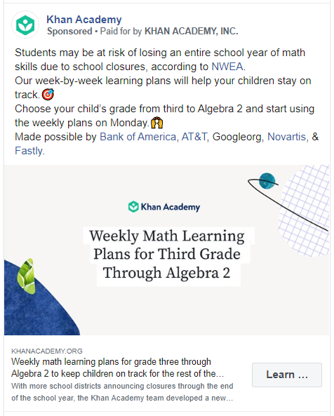
This ad by Khan Academy targets the parents of school going children. They have written a thorough copy to inform their users why they need to sign up.
184. Coursera

This is a testimonial ad by Coursera. It features a direct quote by one of its users. Even in the creative, they have used her picture with her designation.
185. Udemy

As mentioned in the caption, this Facebook ad is targeting health professionals. It tells the users what they will learn in the course and how it will be helpful. They have also made their CTA more attractive by telling the reader about a money-back guarantee.
186. Udacity

Udacity has tried to mention all the features of their projects and courses in this Facebook ad. They put all their efforts into the caption and didn’t really try to design the creative.
187. Yousician

Yousician has used tons of emojis to attract their audience to this ad. They have advertised their guitar lessons here. What really works in this ad is the creative. It looks like a simple stock image but it is beautifully customized for their audience.
188. General Assembly
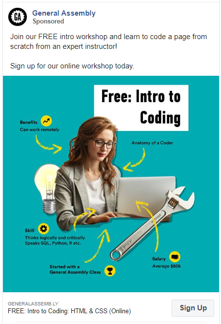
The creative for this ad is another one of my favourite on this list. It’s well thought out, engaging, and self-explanatory. To complement this, they have kept the caption precise.
189. Peloton College

Unlike other college and education ads on this list, Peloton College has kept their copy short. They have just focused on two of their biggest offerings here. Even in the creative, they have used just a stock image.
190. Devmountain

Devmountain started their ad copy with an engaging question. Rather than just telling about what they do, they have tried to make this copy relate to their audience more.
191. IDEO U
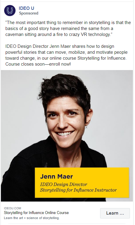
IDEO U is an online school that is promoting its online course in this ad. They have used the image of the person who is conducting the class. For the ad copy, they have mentioned a quote from the same person.
192. Unacademy
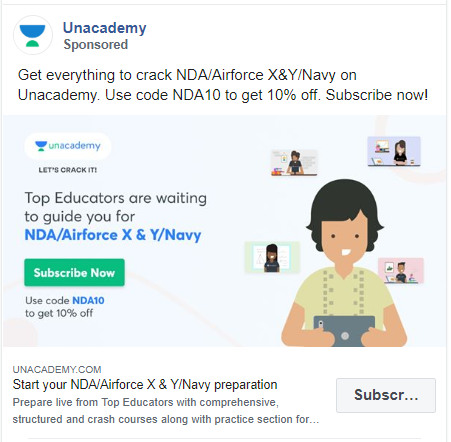
At first glance, you will notice too much text in this ad. They have used the same text by rephrasing it in the caption, image, and heading. They have also repeated their CTA of ‘Subscribe Now’ in all three places.
193. Flatiron School

Flatiron School is not promoting just one course in this Facebook ad. They have a single ad copy for all their courses. It works great because of a beautifully customized ad creative.
Media & News Facebook Ad Examples
There are thousands of companies that put themselves under the media and news category on Facebook. I selected a few of these to showcase how they use Facebook ads to their advantage.
194. The New York Times
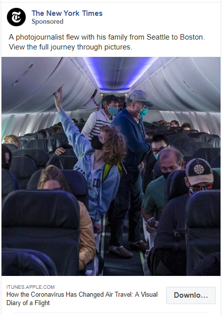
This post is about the current pandemic due to which almost every country has enforced travel restrictions. One of the photojournalists is sharing their experience while travelling from Seattle to Boston.
195. Forbes
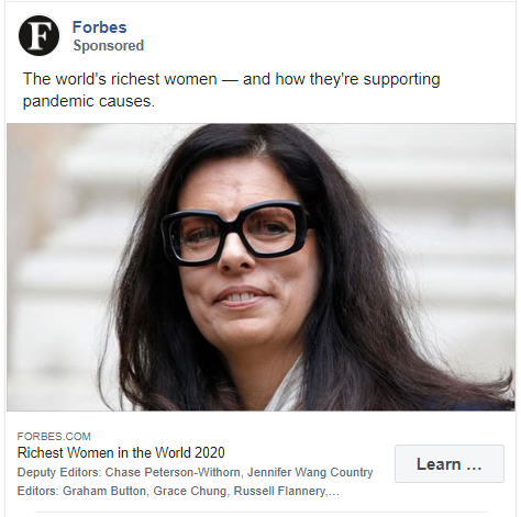
This ad by Forbes has a clickbait title and caption. Even for the creative, they have used just a picture of the women from the list.
196. The Wall Street Journal
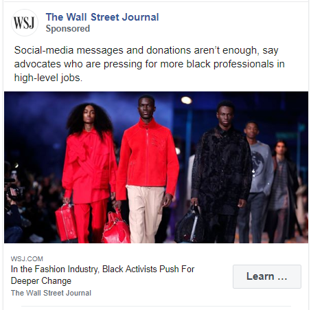
This ad was run during the Black Lives Matter protest in the USA. It promotes an article that states how we need to make deeper changes to end racism against black people.
197. Bustle
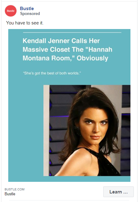
Bustle has targeted this ad for people who love to keep up with the Kardashians. The caption is a simple one-liner and the text on the creative mentions something from the article itself.
198. Guardian Weekly
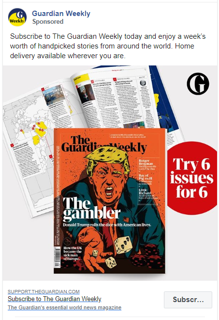
Guardian Weekly have used an unapologetic creative for their ads. It helps them better attract their target audience. The caption, however, tells the readers why they need to subscribe and how they can get this product.
199. CGTN

CGTN is the official website for China Global Television Network. They bring a Chinese perspective to global news.
In this Facebook ad, they are promoting one of their latest articles about how COVID-19 has affected China. With a simple stock image, they have kept the ad copy detailed and thorough.
200. Daily Mirror
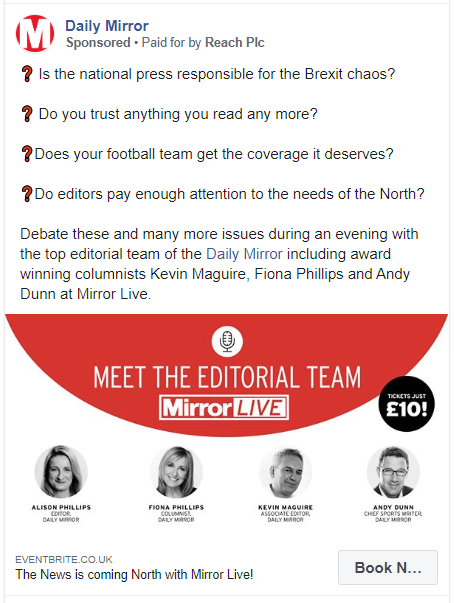
This is an example of virtual event ads in the media and news industry. Daily Mirror have created a creative for this ad with the images of people who would take part in the debate. They have also mentioned the price of the ticket in the creative only.
The caption for this ad is very descriptive too. It mentions all the broad points that will be covered in the debate and they have repeated the names of the people who are a part of this event.
201. Mental Floss
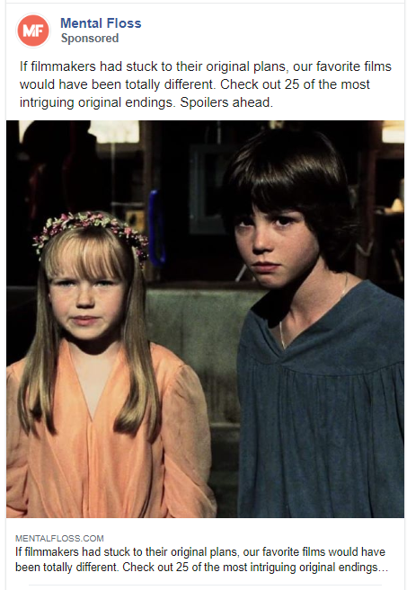
Mental Floss is an online magazine focused on millennials. The news article they are promoting in this ad is also very appropriate for their target audience. They have kept both the copy and the image of this ad simplistic by just telling what the post is about and adding an image from the post.
Food & Beverage Facebook Ad Examples
Like many other industries, the food business has found a massive presence on Facebook. People share recipes, post menus, and show pictures of yummy food to attract customers.
Below you’ll find a mix of Facebook ad examples of fast food joints, restaurants, meal delivery services, and a lot more.
202. Papa John’s Pizza
This video of a pizza can capture anyone’s attention. Papa John’s Pizza have advertised their Shaq-a-Roni by emphasizing on it’s size.
Now how to tell the audience the size of the pizza with an advertisement? Simple, make’em use their imagination – ‘Slices so big, you have to fold ‘em’
203. Revive Superfoods
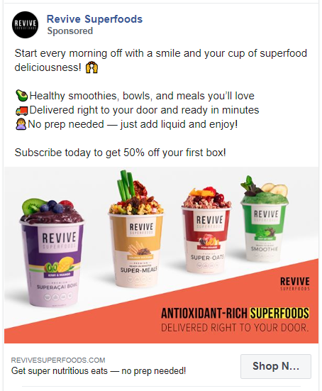
This company delivers delicious crafted Superfood smoothies, oats, and meals. They have mentioned just that in the ad but spiced it up with some emojis.
204. Starbucks
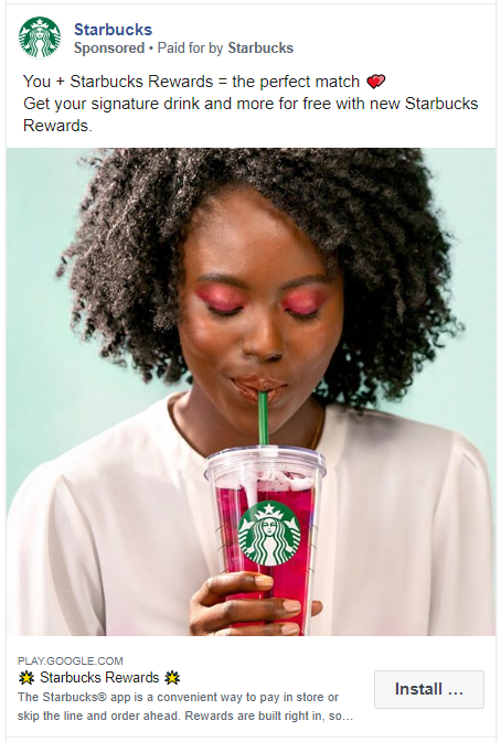
Starbucks is promoting their rewards program in this ad. They have a real person with their product. But the caption is kept simple and engaging.
205. KFC
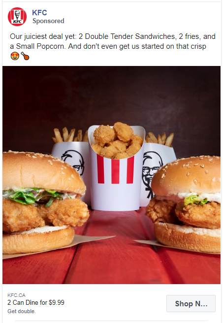
This ad has the juiciest offer ever. Even though the creative just shows the product, what works for this ad is the caption. It mentions what they are offering with a shrewd phrase – ‘Don’t even get us started on that crisp’.
206. Domino’s Pizza
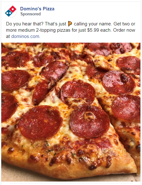
The copy of this ad uses an old phrase ‘Pizza calling your name’, but that zoomed-in image of pizza is enough to make people crave. Also, notice that the link in this ad is only in the caption.
207. Pillsbury
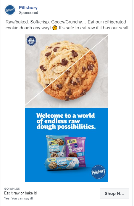
Pillsbury is promoting their raw dough in this Facebook ad. They have split their creative into 2 parts horizontally. The caption tells the readers many ways in which they can eat this product. They have also made a small brag by saying ‘It’s safe to eat raw if it has our seal!’.
208. Tribe
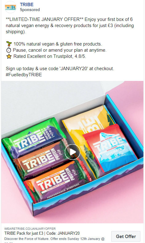
This is a stop motion video ad. The 3 protein bars change their position in different frames. You can easily create such videos from your phone.
The caption of this video ad starts with an all capital letter that instantly captures attention. They have also used emojis to mention the various features of their product.
209. Nestle Toll House
Another Facebook ad example of raw cookie dough. But this one takes a chessy route. The caption starts with ‘Wanna spoon with us?’ and the video starts with a text saying ‘Spooning in bed…’. Using such humour makes the ad more shareable.
210. Thistle
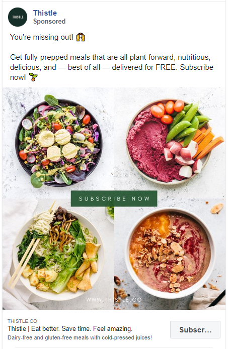
Thistle delivers ready-to-eat meals right to your doorstep. Their target audience consists mainly of people who eat healthy or who want to eat healthy. They have easily gained their attention with 4 product images of healthy bowls and a caption that says ‘You’re missing out!’.
They have also mentioned the USP of their prepped meals in the caption.
211. Purple Carrot
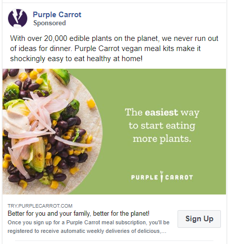
Purple Carrot deliver plant based meal kits to their customers. Their target audience is people who are vegan.
They have used a great color psychology trick in their ad creative by using the color green in the background. Their caption is also very smart on words. Instead of saying they have a variety of food options, they took a creative approach.
212. Blue Apron
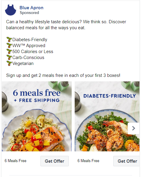
This carousel ad also uses emojis as bullet points to highlight the features of the product. But instead of using different emojis, Blue Apron has repeated the same one. It could work well in capturing the attention of the audience.
They have also used the similar repetitiveness by adding these points above every image in the ad.
213. Daily Harvest
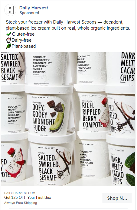
Daily Harvest is promoting their plant-based ice-creams in this ad. Their creative just features multiple images of their product with no text. But this makes it easier for the audience to actually read the packaging of the product. This way, Daily Harvest doesn’t have to separately mention that they have a variety of flavours to choose from.
214. Kate Farms
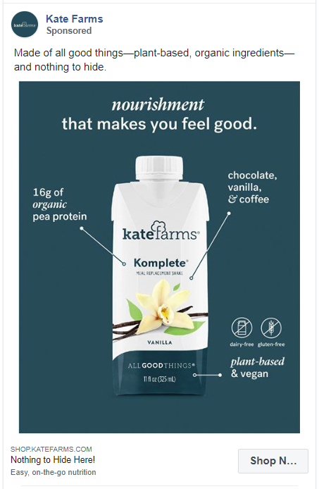
Kate Farms make plant-based shakes & formulas that taste great. They have used the entire ad space to show the features of their product. The caption, the image, and the headline tells the readers why Kate Farms is better than others.
215. NatureBox
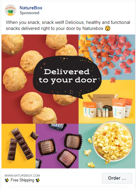
NatureBox sells healthy and clean snacks. They have used multiple images of their products in this ad creative. It looks very attractive because of the custom layout and color choices. They have also added a text bubble on this ad to further customize the graphic.
216. Black Rifle Coffee Company
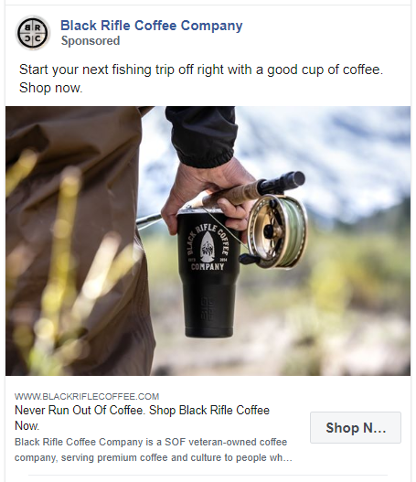
This SOF veteran-owned coffee company has taken a unique approach to sell their coffee. They have also added a great CTA in the headline of the ad.
217. DAVIDsTEA

DAVIDsTEA has promoted its blog article about the golden milk latte recipe. This recipe uses their product Turmeric Glow tea. They have used an image of the finished drink with all the ingredients around it.
218. Four Sigmatic
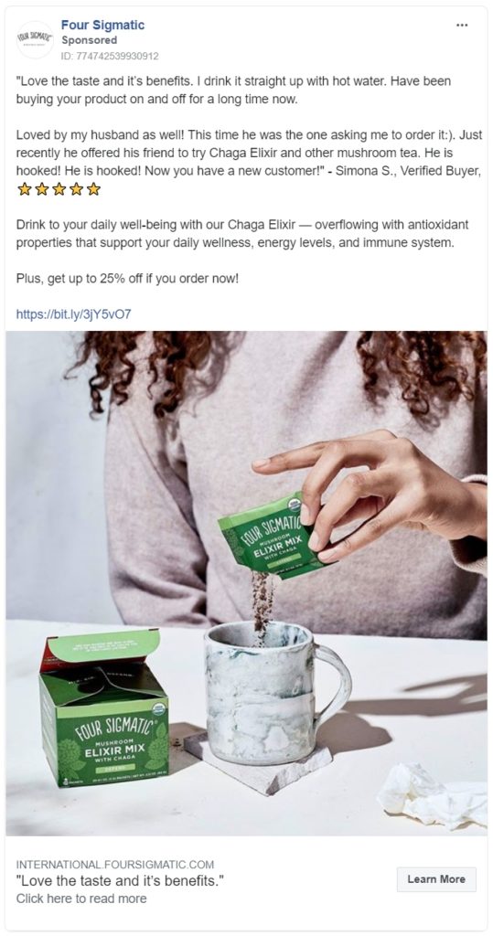
Four Sigmatic is promoting its elixir mix with testimonials in this Facebook ad. They have added the testimonial quote from their client in the ad copy with a discount code. For the creative, they have used the image of their product and its packaging.
219. Gainful
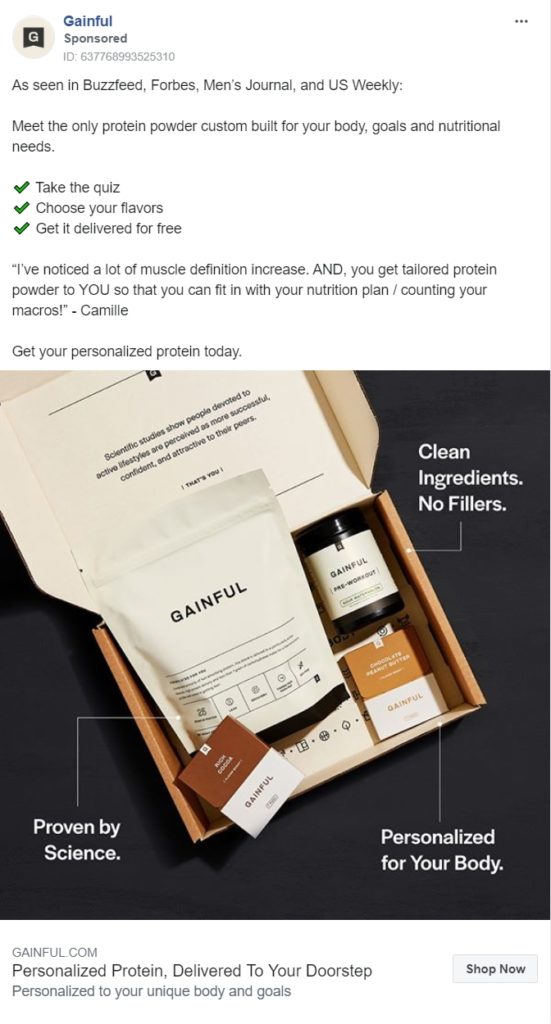
Gainful sells personalized protein powder tailored according to their customer’s body type and fitness goals. They have created an all-in-one ad for their product. It tells you their USP and how you can order. It includes a testimonial and a great CTA. The ad creative also shows their product elegantly.
220. Thrive Market

Thrive Market has promoted their healthy food delivery in this ad. They have added multiple products in one image. Also their caption is simple yet attractive with a great offer.
221. Gousto
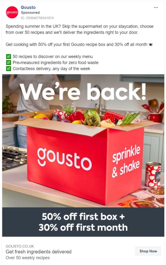
Gousto is majorly targeting people who aren’t from the UK but are spending their summers here. They have mentioned all their unique features in the caption with a discount offer. The same discount offer is repeated in the ad creative with an image of their product packaging.
222. Hello fresh
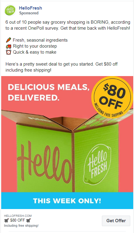
Hello fresh is another meal kit delivery service on this list. They have also used the ad copy to convey what their products include and how their service is unique. They have also added an $80 discount with this ad.
223. ButcherBox
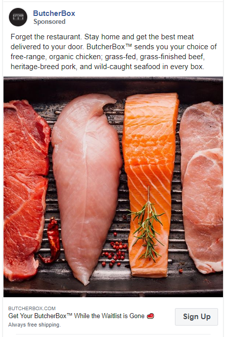
ButcherBox has one of the most tempting images for a meat lover. The close-up shot of chicken, salmon, beef, and pork makes them look fresh and healthy. They have also mentioned the specialty of these meats in the caption of the ad.
224. Imperfect Food
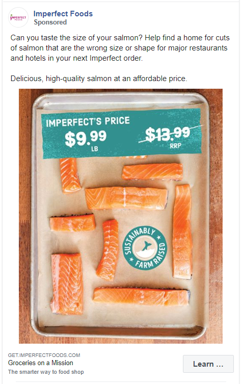
Imperfect Foods delivers groceries but they have focused this ad on seafood, more specifically salmon. They have added the price offer in the ad creative to attract more customers.
225. Kroger
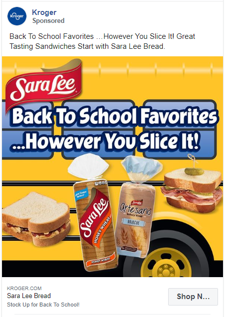
Kroger has used a very eye-catching graphic for this ad. Some might find it attractive, some won’t but almost everyone will stop scrolling for this. They have promoted their bread with back to school motto.
226. La Colombe Coffee Roasters
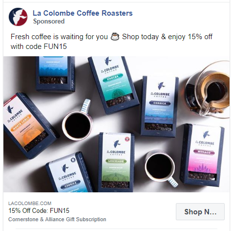
This is another Facebook ad example of a coffee company. La Colombe Coffee Roasters are promoting their special coupon code here. They have shown different flavors of their coffee in the ad creative.
227. DoorDash
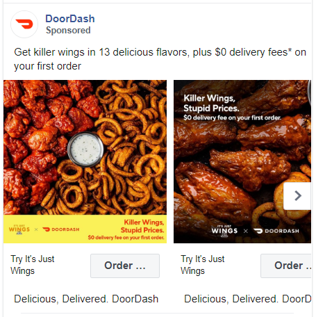
This carousel ad includes some of the most delicious pictures of chicken wings. A short caption is also added to accompany these images.
228. LYFE Fuel
If you find creating video ads too tiring and costly, you can try something like this. LYFE Fuel added an animated text on top of a still image. A simple CTA, shop now!
This won’t take up too much of your time and would still be a fun experiment from typical picture ads.
229. Magic Spoon Cereal
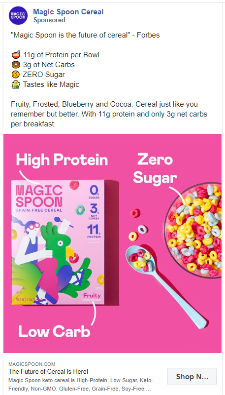
This ad is stunningly eye-catching with on-point brand colors, box of cereal, and a bowl. The text on the image and the caption is also identical as they both point out the unique features of this cereal.
The caption also includes a quote by Forbes to make this product even more credible.
230. Hungryroot
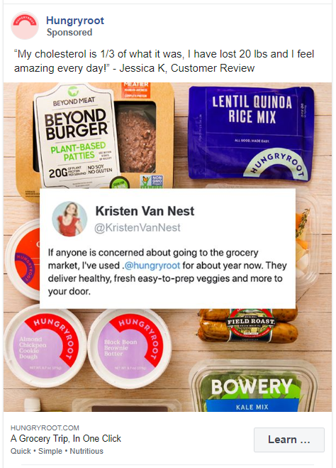
There is no rule on how many testimonials you can add to your copy. Add one in the caption and another in the image.
Also, just like Hungryroot try using the actual screenshot from social media sites. They sound more authentic.
231. Burger King
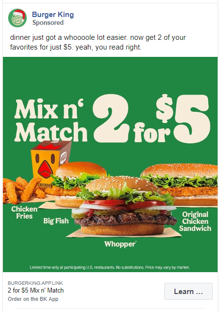
Burger King has kept this ad very simple with an old catch phrase and prices of their products. For the ad creative, they used the images of their products with big bold text announcing their offer.
232. Misfits Market
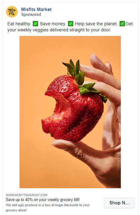
Misfits Market delivers organically produced fruits and vegetables to their customers. They ran multiple variants of this Facebook ad, with the same copy but different creatives. Each creative had a single image of a fruit or a vegetable grown organically.
233. OWYN
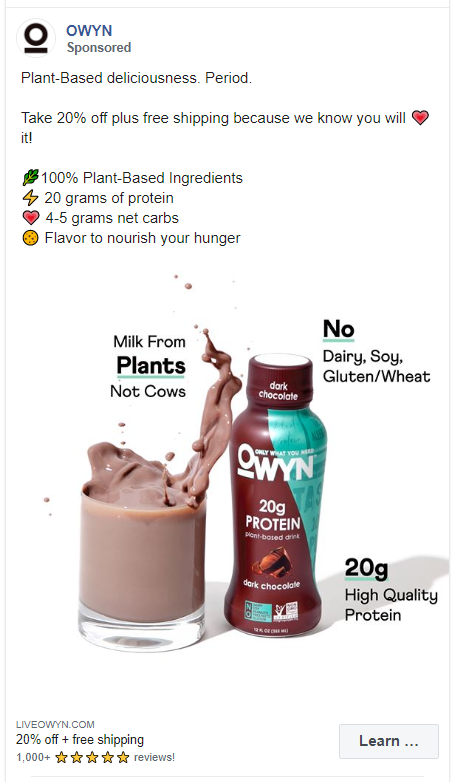
This Facebook ad features an ad creative that uses white space. It shows the product and the packaging with its features. Also the effect of the drink bouncing out of the glass is very unique.
The caption of the ad repeats the same features mentioned in the image.
234. Sun Basket
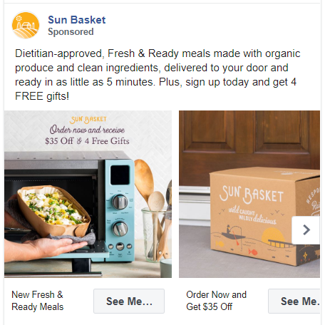
Sun Basket is also promoting its ready-made meals in this ad. They have used a carousel ad to show more pictures of their food and packaging.
The caption also makes itself enticing by saying words like ‘dietitian-approved’ and ‘Free Gifts’.
235. Chopt Creative Salad Co.
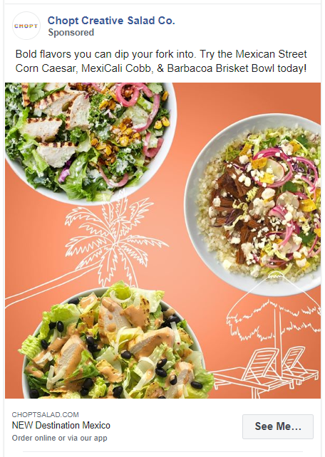
This Facebook ad has a common theme of ‘Mexico’. The creative used is a well-edited image of 3 salad bowls. The caption mentions the names of these salad bowls.
Fitness Facebook Ad Examples
More and more people are turning to the internet for health and fitness advice. A lot of fitness coaches, dietitians, and nutritionists provide online classes to their users.
I have compiled a few of such Facebook ad examples from the health & fitness industry below.
236. Love Sweat Fitness
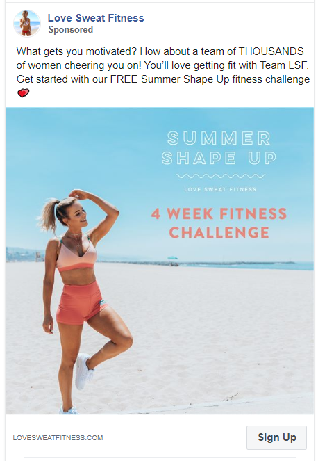
Love Sweat Fitness by Katie Dunlop is a community of women dedicated to a healthy lifestyle. Their Facebook ad is targeted towards women who want to get fit.
For the ad creative, Katie Dunlop has used a picture of herself on a beach and added some engaging text. She has also made the caption enticing by telling the audience that this fitness challenge is ‘FREE’.
237. Swolverine
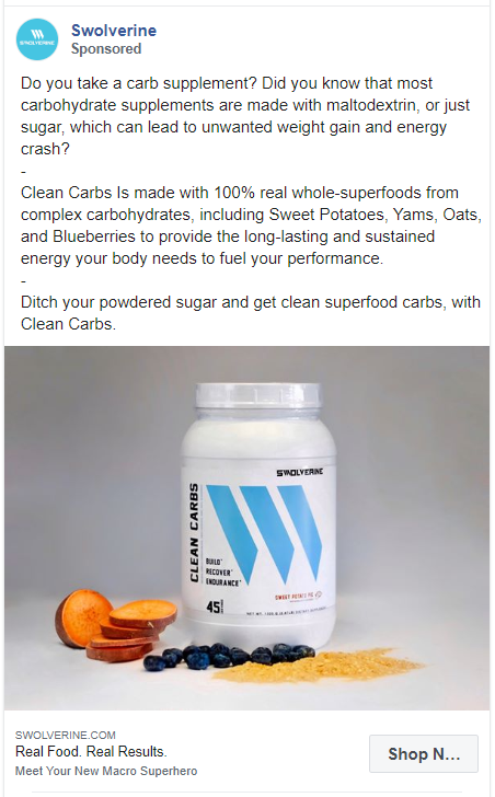
Swolverine has promoted their product Clean Carbs in this ad. Since this ad is target to people who take carb supplements, the ad copy feels personal. It tells the users what they are taking and how it is bad for them.
They have mentioned all the ingredients of their Clean Carbs to entice the user even more.
238. Fit2Fat2Fit
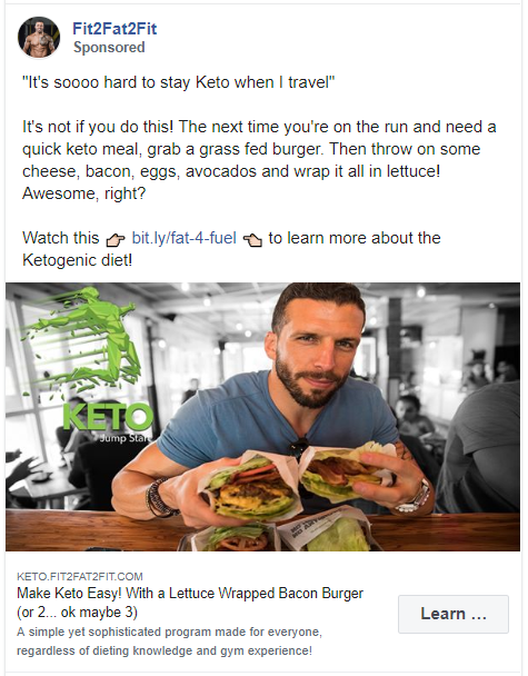
This ad directly talks about the biggest pain points of people who choose the Keto diet. Also, this is another example of a Facebook ad that uses multiple links.
239. Conscious Muscle Vegan Fitness & Nutrition
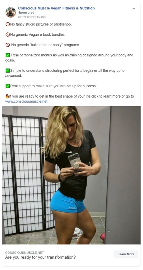
Just as much you tell your clients what you do, tell them what you don’t. Everything bad that your competitors are doing, tell them you aren’t.
240. Tracy Anderson Method
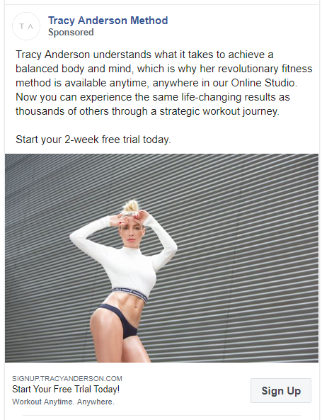
This ad promotes Tracy Anderson’s revolutionary method available in an online studio. It uses just an image of Tracy herself with a CTA of a 2-week free trial.
241. Les Mills
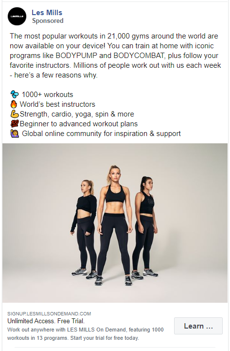
Another Facebook ad example that uses exact numbers to grab the attention of their audience. Also, all the features about this product are arranged in bullet points made up of emojis.
The ad creative, however, looks like a simple stock image.
242. solidcore
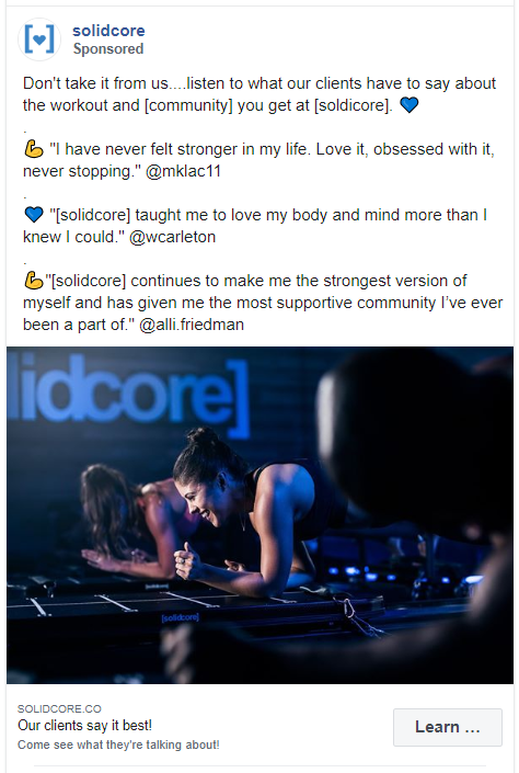
This ad by solidcore uses multiple direct quotes from customers in their caption. To make these testimonials more reliable they have tagged their clients in the ad.
Wrapping Up – Facebook Ad Examples
And that’s it!
That was a long list of my favorite and the best Facebook ad examples. But I tried to cover as many examples as I can from various industries.
Now you can go and try creating your own Facebook ad campaign.
Remember to create a relevant ad copy, catchy visuals, and simple call-to-action.
If you need help with designing better quality and custom designs. Get in touch with our design team ASAP.


