Your landing page is one of the most important things in your sales funnel. You have to make sure it’s optimized to engage and convert every visitor.
For this, you’ll have to pay attention to both your landing page design and copy. These two together play a key role in increasing your sales or subscribers.
However, this article focuses only on the landing page design tips and best practices.
The Do’s of The Landing Page Design
The definition of an ideal landing page will vary depending on your industry. You’ll have to add and optimize different things according to your target audience. But here are a few common things to consider for your landing page design:
1. Go Minimalistic
Your landing page serves a single purpose that can be lead capture, sales, or anything else. You have to make sure you direct your visitors to fulfil that one purpose only.
If you add too many elements, you’ll risk distracting your visitors. So, try keeping everything minimal.
Broadly, you should focus on only adding the following 7 elements to your landing page design:
- The main headline and a sub-headline.
- The benefits of your offering.
- Images or videos showing the context of use.
- Social proof.
- A call to action.
- A form or buy button.
- A closing argument.
For example, this Invideo's website landing page design features all the things mentioned above. It is simple and free from all distractions.

Few things you can do to achieve an uninterpreted user experience is avoid using navigation bars, footers, sidebars, or links to other pages on your site.
2. Use Interactive Elements
An interactive element responds to a user’s interaction, and it complements the user journey with functional and captivating interaction.
Adding such elements to your landing page design keeps your visitors engaged.
For example, see how Bellroy uses interaction on their website:

You can also ramp up your standard scrolling with animations such as vertical or horizontal swipe transitions. Hover animations are also very common on landing pages.
One thing to keep in mind while adding such elements is that it might affect your page load speed. So, try using next-gen image formats to optimize your landing page images.
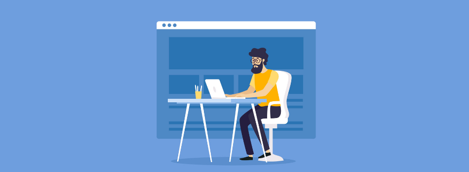
3. Make Professional Graphics
What we define as professional and unprofessional might be very subjective. But for me, something like this is an unprofessional design:

The colors do not complement each other, there are different types of fonts used, and most of the text written on the laptop screen is not readable. And if this is what you use on your landing page, your visitors will leave right away.
You have to use high-quality and professional graphic designs on your page. If you can afford it, take help from a designer, and if you cannot, then use good design resources and tools.
Some of my all-time favorites have to be:
- Blush and Freepik for Free Illustrations
- Flaticon for Icons
- Canva and Colorcinch for Image Editing
- Biteable and Animoto for Video Making and Editing
4. Remain Consistent
Your visitor will arrive at your landing page through third-party sites like Facebook or Google Ads. They want to see more of what you offered in your small ad space. And if your landing page presents something completely different, the visitors will feel disconnected.
You need to have consistency in both the visual design and the message of your ad, where the user first clicked, and your landing page.
That means you have to use the same color theme and template for the design. You also have to use the same kind of images, i.e., if you used illustrations in the ad, don’t switch to stock photos on the page.
5. Choose Colors Wisely
Now that you know you have to use similar colors in your ad and your landing page design, you have to figure out what colors to use.
Ideally, most companies use the same color palette as their website. But you can always experiment, depending on your product or service.
You can consider adding colors based on color psychology.
Think of what you want your product ads to represent. If it’s something playful, you can go for orange or yellow. If it’s related to nature, you can choose green.
Below is an image that’ll tell you what color represents what kind of emotion.

If you want to use this infographic, here’s the download link. Just make sure to credit us by linking back to this page.
6. Emphasis on the CTA
The CTA of your landing page is very important. Everything else you do on your page is trying to get people to push that one button.
You have to make sure it’s loud and clear. The visitors should be able to distinguish it from every other element.
For example, this is one landing page design inspiration from Skillshare:

They have so much going on in the background image, yet you can clearly see the CTA button.
7. Use Videos
Buyers want to see your product in action. A video that shows how to use your product or how it looks in action will have a very positive impact on your conversions.
Think about it, people are always more willing to click on a video than read a paragraph.
If you don’t have a product demonstration on a video, you can also consider adding a small GIF.
Just make sure your video is relevant to your page. It should complement your message and not distract the user.
8. Test Design on Different Browsers
Each browser renders HTML, CSS, and JavaScript in its unique way. So what your landing page design looks like on one browser might not be the same in other browsers.
Test how your landing page looks on different browsers. How long does it take to load? And most importantly, how do mobile users see it?
Your designs should be compatible with different browsers, and they should be mobile-friendly.
The Don’ts of The Landing Page Design
Now that we have talked about the things you should do to your landing page, let’s also talk about the things you shouldn’t.
And again, a lot of these things are subjective. For example, adding an FAQ section might be great for some businesses, while it might be useless and distracting for others.
Yet there are a few things that are a big no-no for a good landing page design.
9. Use a Template
The internet is filled with ready-to-use templates for landing pages. These templates practically guarantee conversion.
But do they really work?
I don’t think so… The user today is very smart, they can make out a difference between a template and a personalized message.
I am not saying all templates are bad, but most of the free ones are. They have been used over and over by so many businesses that now they look spammy.
And if you are going to spend money on a template, you might as well hire a designer or a design agency to help you out.
The goal should be to deliver a personalized experience to every visitor.
10. Add a Navigation Bar
This is the biggest blunder in a landing page design.
Adding a navigation bar will definitely distract your visitors from the actual purpose of your landing page. It will massively drop your conversions.

Make your landing page a dedicated place for only one offer. If you have other services to promote, make another landing page for them.
11. Use Stock Images
Even though they are still popular, a majority of the internet has stopped trusting stock images. Imagine clicking on an ad for a personality development course, and you see this image:
Not a very good impression!
Another alternative to stock images is illustrations. They appeal to a broad section of the users, and adding an illustration also makes your page look like you actually put in an effort.
You can find free illustrations on websites like Blush and Freepik.
Also, refer to my guide on the 16 free illustrations website.
To Sum Up…
A landing page will decide the success of your marketing campaign. Make sure it’s well-optimized with high-quality images, an attractive color palette, and readable fonts.
If you need help with your landing page design, sign up for our unlimited graphic design services. Our professional designers will design your landing page and our development team will build them in any of your favorite drag-and-drop page builders or in plain-old HTML/CSS.


