Most companies create informal branding guidelines from the early stages. But as a business starts getting some traction, a formal brand style guide becomes a necessity.
A brand guide will be a document that’ll define the rules and guidelines that your company needs to follow while presenting itself to the world. It includes basic information about the company’s logo, font, colors, brand positioning, etc.
People often refer to the brand guide as a style guide because both these documents contain details about the company’s visual identity. But a brand guide contains a more in-depth description of your brand’s image and strategy.
So the next question is, how to create a brand guide? It isn’t a simple task that you can accomplish in a day or two. Creating brand guidelines requires a lot of research, time, and resources. Even if you hire a graphic designer, you’ll have to invest time and effort to make a good brand guide.
It sounds overwhelming, that’s why I wrote this guide to simplify the entire process. In this article, I’ll explain what to include in a brand style guide and the process of making it yourself or with the help of a designer.
I have broken down and organized this guide into different sections. You can use the table of content below to navigate through each section.
How to Create a Brand Guide?
- Write Your Vision, Mission, and Values
- Define Your Brand Positioning
- Find a Brand Voice
- Logo Design
- Create a Color Palette
- Define the Font and Its Usage
- Other Imagery Guidelines
Let’s dive into some details…

1. Write Your Vision, Mission, and Values
To build a strong brand, you need to connect with your target audience, employees, and stakeholders. And you cannot achieve this only via a good product/service. Your brand’s vision, mission, and values will reflect who you are and what you represent.
Let me explain each of these in a little more detail:
Mission Statement: Why Does Your Brand Exist?
Your mission statement defines the reason for your company’s existence. It’s something that represents your brand and connects with your employees and customers.
And even though this feels like a tough job to write your mission statement, it really isn’t. You created a company, and there must be a reason for that. You just need to put that explanation into a short sentence.
For example, the mission statement for Tesla is “To accelerate the world’s transition to sustainable energy”. It’s simple and designed to reflect what the company does.
You have to find words that describe “What Your Company Does” and “How It Does That”. And you’ll have a mission statement.
Vision Statement: What Do You Aim to Accomplish?
A vision statement describes your company’s long-term goal. For example, the vision statement for LinkedIn is “Create economic opportunity for every member of the global workforce”.
Just like the mission statement, it’s short and precise. It provides inspiration and purpose to the stakeholders and the employees.
Brand Values: What Yours Represent? How Do You work?
Brand values are the principles that guide and represent your business. For example, Sprout Social is a social media management and optimization platform and its brand values are:

While writing your own brand values, you need to set yourself apart from your competitors. Think about morals and ethics that make your brand unique. Something that appeals to your employees and your target audience.
2. Define Your Brand Positioning
The next part of your brand style guide is a positioning statement. If you don’t already know, your brand positioning is the way your audience perceives your brand.
For example, Dollar Shave Club is a company that offers shaving products. They have positioned themselves as a more affordable alternative to Gillette. It’s reflected in their name, marketing style, content, and design.
Including a brand positioning statement in your brand style guide will give the reader an idea of how your brand is differentiating itself from its competitor. This information will also help you in creating marketing strategies, designs, and content that caters to the right audience.
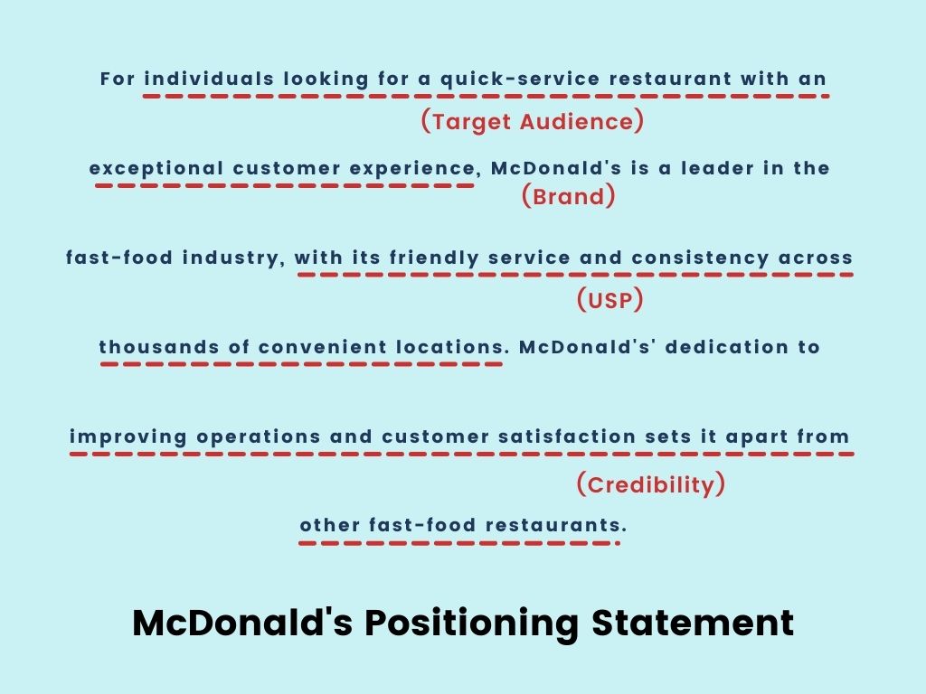
Now if you are confused about how to write this part you’ll need to start with some market research. If your company has been active for some time, you’d already have a market position. But you need to analyze whether or not that positioning is what you want.
For example, you’re selling protein bars that are affordable, filling, and a nutritious on-the-go snack. But in reality, your potential customer finds your product more expensive than other similar products in the market. Then you have gone wrong in positioning your brand and you need to start from scratch.
A good way to start would be by analyzing your competitors. How are they marketing themselves? What stands out on their website and content? Are they targeting a specific market or industry? You don’t have to copy what your competitors are already doing, in fact, you have to set yourself apart from them.

3. Find a Brand Voice
Most traditional brand style guides only talk about the design components like logos and colors. But if you’re creating a style guide today, you need to include brand voice guidelines too. It’ll help your design and content team maintain consistency while communicating with the audience.
Now finding a unique voice might sound a little tricky. But your brand voice already exists. You just need to identify it. Start by auditing your website content, blog, and social media. You need to find at least 3 adjectives that describe your brand.
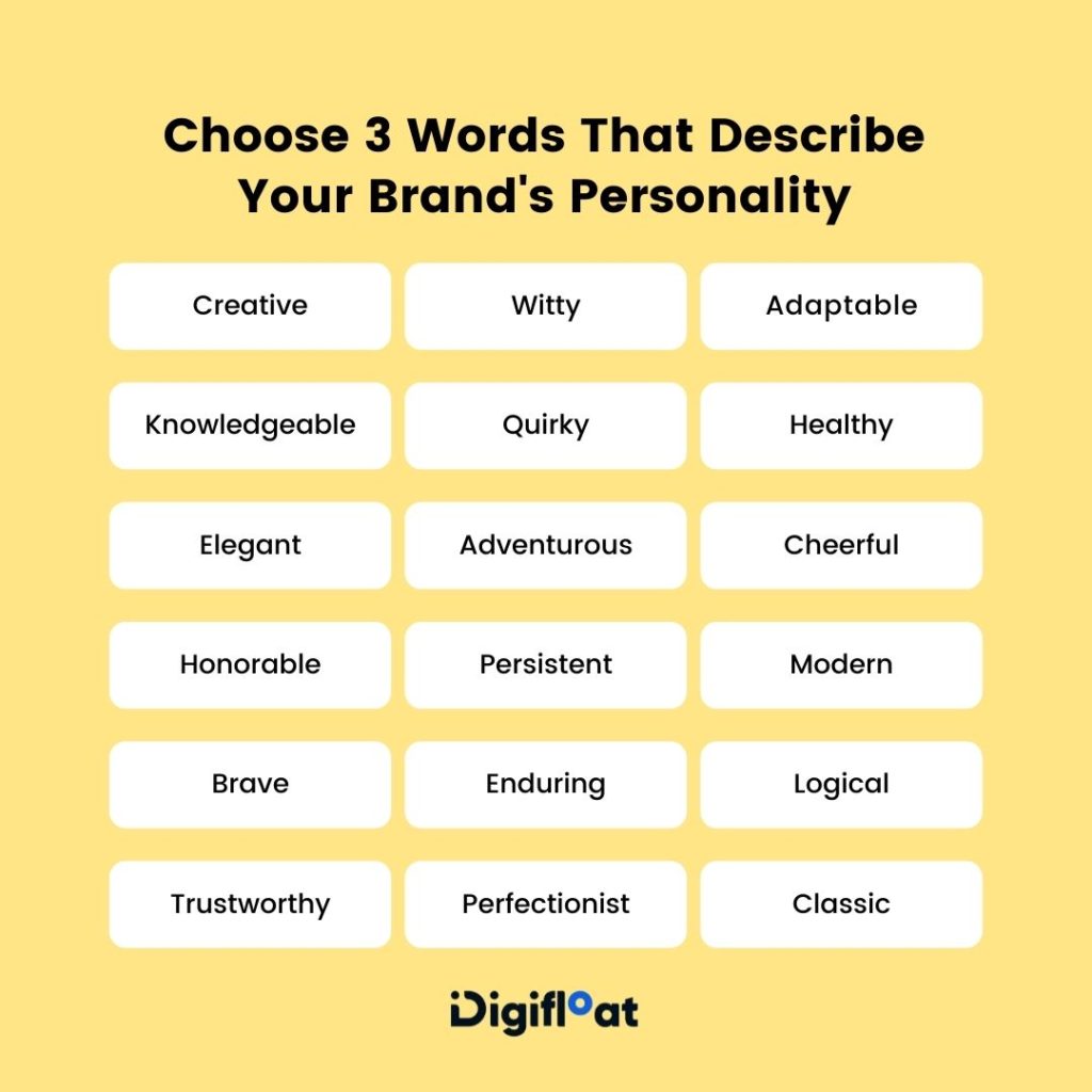
Once you have these words, you can create a brand voice description and list down some do’s and don’t for your brand.
For example, if you defined your brand as quirky, then an ideal description for these characteristics would be that you have an unconventional brand that isn’t afraid of challenging the existing conditions and being yourself.
Similarly, if your brand identifies as authentic then your brand voice will be defined as unbiased and honest. No jargons or marketing gimmicks whatsoever.
4. Logo Design
This section of your brand guide includes instructions on how to use your logo. It includes details about the colors of your logo, typography, style, spacing, etc.
Let me elaborate on this with an example of our own brand style guide. We start by specifying the clear spaces, also called the exclusion zones, around our logo:
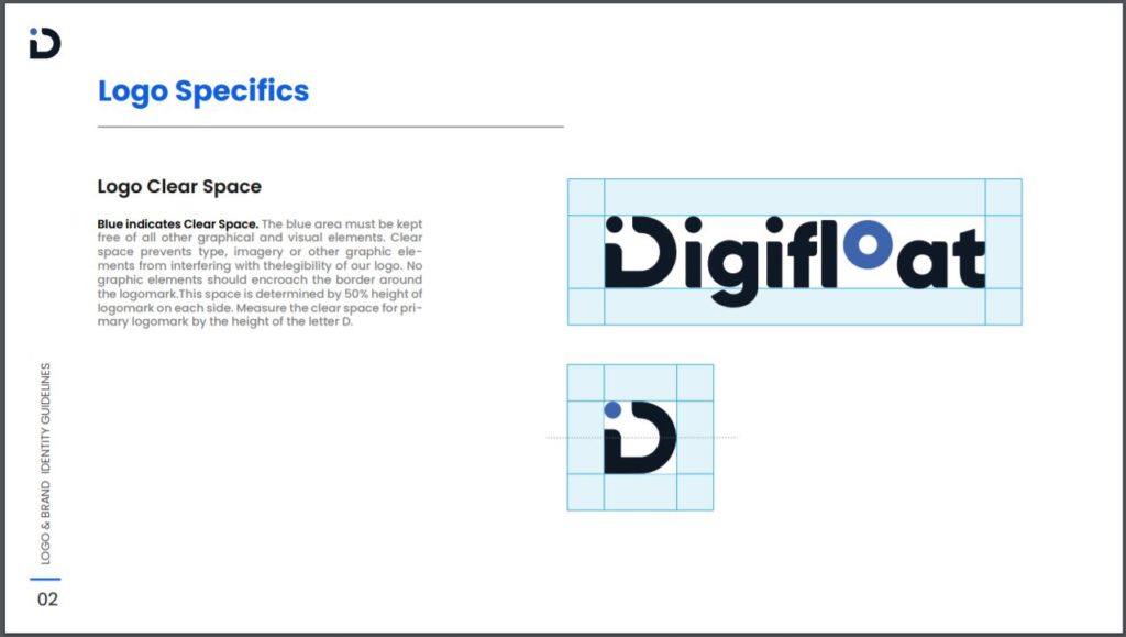
Then we have included different logo styles that need to be used on different platforms:
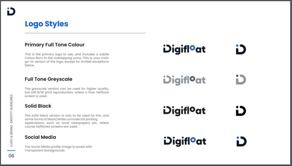
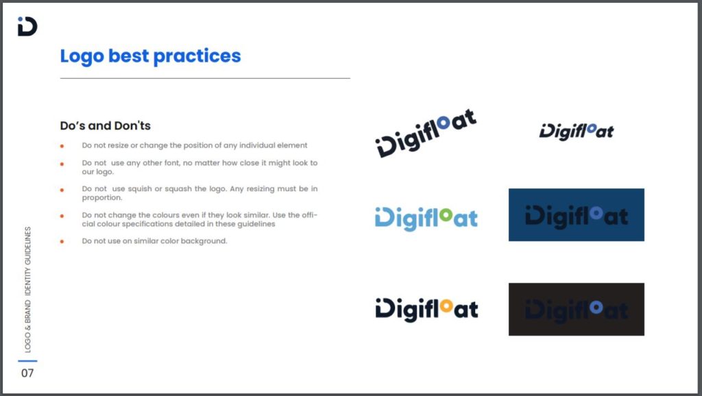
I would also advise you to mention the do’s and don’ts of your logo design in the brand style guide. This will ensure that your logo isn’t realigned, stretched, or altered to send any wrong impression of your brand.
5. Create a Color Palette
Think about any popular brand, you’ll instantly remember their logo and their brand colors. For example, Airbnb is associated with the color Red, Burger King is Red and Yellow, Cadbury is Purple, Facebook is Blue.
This is not a coincidence. These brands have consistently incorporated similar color palettes in their branding to increase their recognizability. It also helps attract the attention of their target customers.
So you need to create a color palette for your brand. And when you add your color palette in the brand guide, you’ll need their HEX codes, RGB or web colors, CMYK or print colors, swatches, and best practices. It might sound confusing, so let me explain this from the start:
A. Pick a Primary/Base Color
In simple terms, this is the color that’ll be most visible in branding. While choosing this color, you’ll have to consider what you want your brand to reflect.
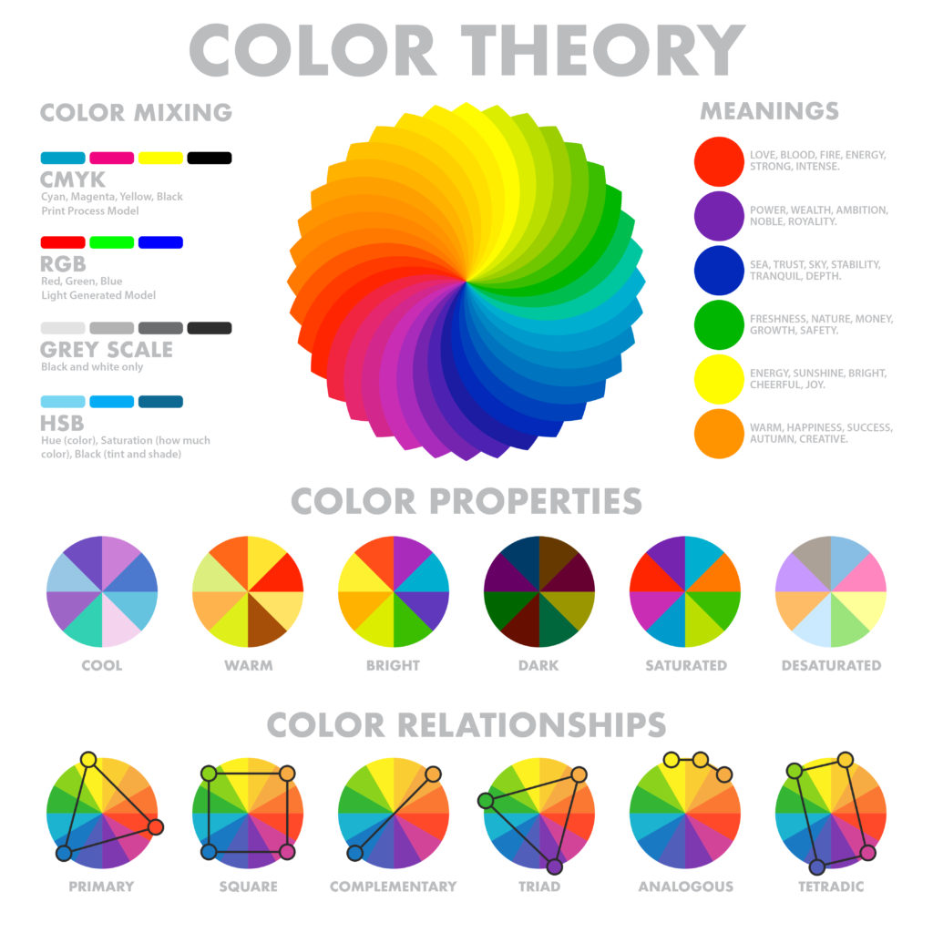
Different colors evoke different emotions and reactions. It’s called color psychology.
Use this image to better understand the colors and their meanings:
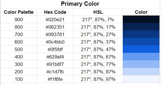
Once you select a primary color, you’ll also have to pick 4-5 different shades from lightest to darkest for your primary color. The lightest one could be used as the background color and the darkest as the text color in your designs.
So for example you choose blue as your primary color, this is how the palette would look like:
You can use an online tool to generate different shades of color. I really like this free online tool called Paletton. It’s effective and easy to use.
B. Choose Shades of Grey
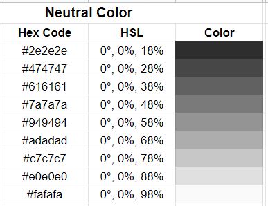
The color grey is the most used color in any design. From texts to background, the majority of the interface is grey. That’s why it’s best to pick a variety of shades from the very beginning.
I have created this table for you, pick 4-5 shades from lightest to darkest for your brand:
C. Accent/Complementary Colors
These are the colors that are brighter than the primary colors. They are added to highlight different features and to grab the user’s attention.
For example, in the following image, the yellow in the CTA above and the shades of purple in the main CTA button are the accent colors:

Choosing these colors can be tricky as you have to make sure they charm the user and complement your primary color.
I would recommend using an online tool like this one from Purple11 to pick complementary colors for your brand. It’s also a free tool, and all you need to do is enter your primary color and they’ll suggest the best complementary colors:
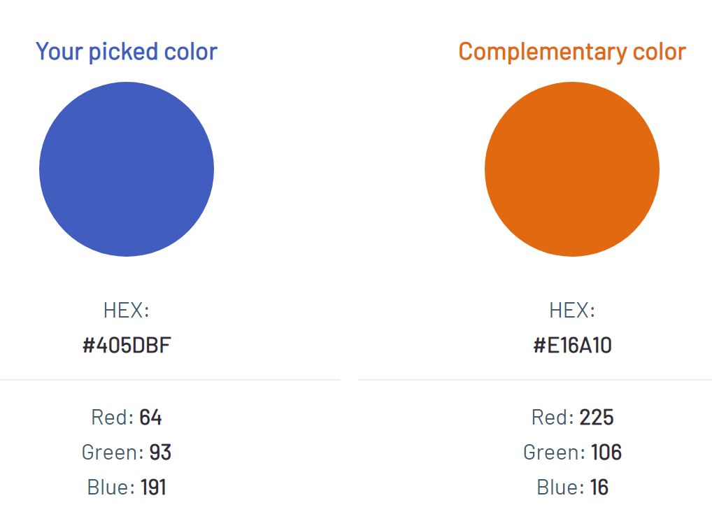
Once you have selected all these colors, you can add them to your brand style guide easily.

6. Define the Font and Its Usage
Typography is another element of design and a very important part of your brand style guide. And when I say typography, it isn’t only about the typeface or the font. It also includes the size, space, length, alignment, etc. All of which need to be included in the brand guide.
For example, have a look at the Uber brand guide, where they talk about their typography. They have described how to pair their font, hierarchical system, size, and guidance.
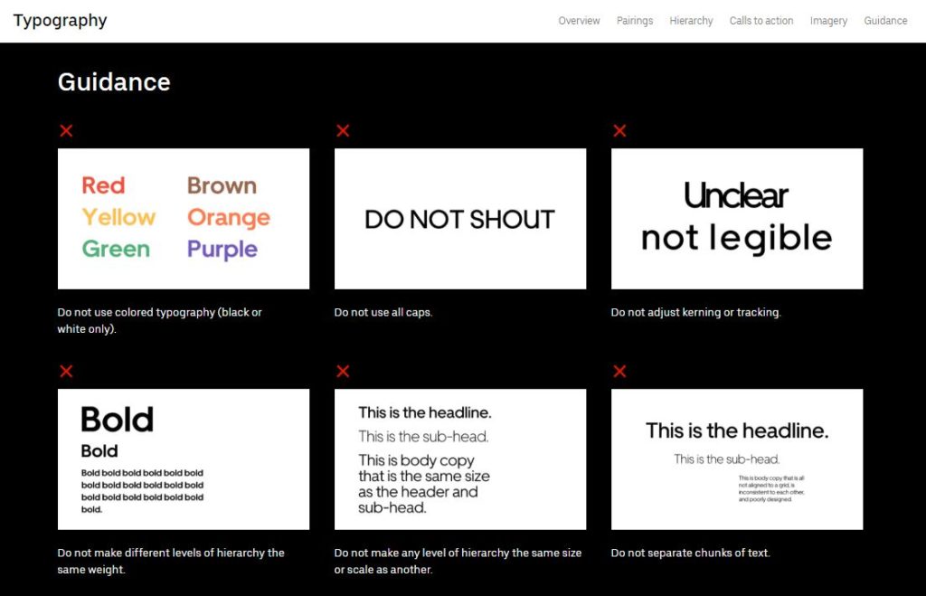
While writing this section of the brand guide, you have to determine standard sizes for the headings, subheadings, paragraphs, and CTAs to ensure consistency. Other than that, you have to include the tracking and kerning ratios and alignment details.
And just like Uber, you can also add the acceptable criteria for adding color to the fonts and guidelines on using fonts on imagery:
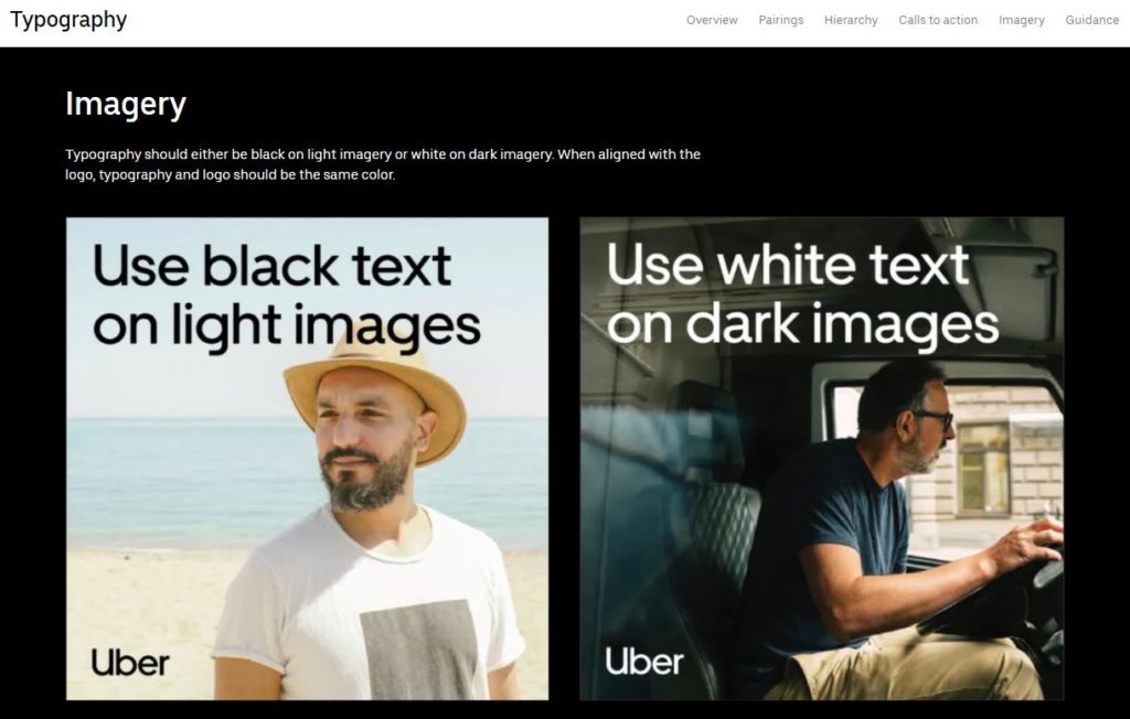
7. Other Imagery Guidelines
When you build an online presence, you use icons, illustrations, and stock photography of some kind. These images aren’t the same, but they require consistency. That’s why you are required to create some guidelines regarding their style, colors, and other attributes.
Starbucks, for example, likes to use product photos that are beautiful and believable. And stock images of people who look real, authentic, and relatable. They take care of subtle details like lighting, shadow, angle, and composition to create brand consistency. All of this is clearly stated in their brand style guide:
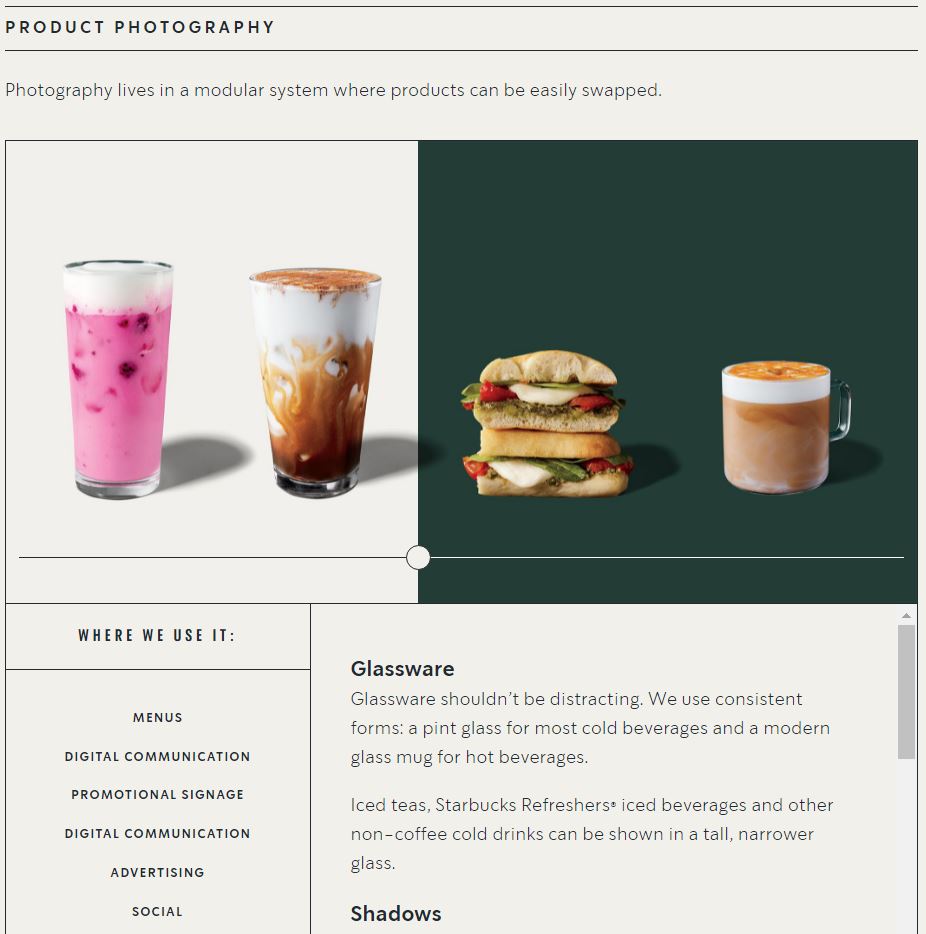
Similarly, if you choose to use illustrations instead of stock images, just like we do at Digifloat. You need to include the kind of style and colors that are acceptable and a few examples of the images that are not acceptable by the brand.
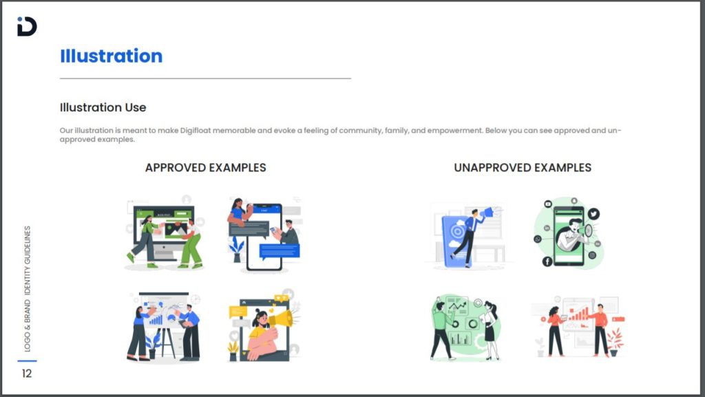
If you have created a customized illustration or icon pack for your brand, it needs to be included in your brand style guide too.
Let’s Sum Up: How to Create a Brand Style Guide?
By creating a comprehensive brand guide, you can ensure consistency in your branding. This consistency will not only help you stand out from the competition but also improve your company’s total revenue.
I tried to guide you through everything that should be included in your brand guide. But every brand is unique. So if you feel like you want to include more details, feel free to do so. Just make sure your brand guide is solid and established to guide the reader but also flexible enough for designers to be creative.
If you want to collaborate with an experienced designer to create your brand style guide, sign up for our unlimited graphic design services. We can help you rebrand or build your visual identity from scratch.

